I’ve written about using valuation till I’m blue in the face, in particular using the CAPE ratio. (Here is a an old summary post.) Despite the fact that sorting countries on global CAPE ratios is having a monster year, people are still very critical on using CAPE. I tweeting this out earlier:
CAPE ratios of country stock markets around the world:
Cheapest 11: 9.5 (Brazil up >70% YTD)
Expensive 11: 23.5 (US is 26)
But people still love boiling the ocean and examining all of the minor flaws and nuances of CAPE in particular. Despite having written a book, white paper, and countless articles on CAPE I’ll be the first to tell you:
I don’t think the exact valuation metric matters.
Let me explain. Using any one indicator can bias you to structural characteristics of that indicator. For example, there are reasons Aussie companies usually have a higher dividend yield. Is NIPA, GAAP, CRAP, or some other earnings series the best series for US stocks? What about the nuances of tiny stock markets – is CAPE reliable there?
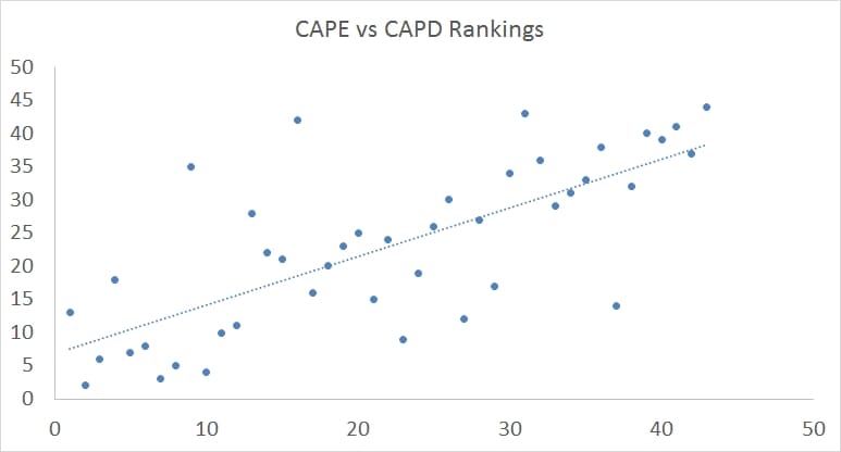
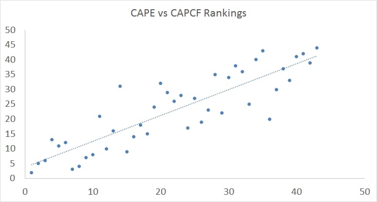
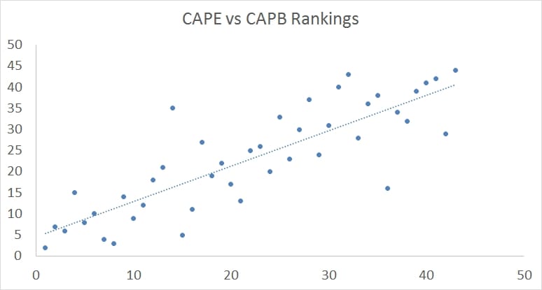
This is one reason we publish not only quarterly updates for CAPE on The Idea Farm, but also CAPD (dividends), CAPCF (cash flow), and CAPB (book). And not surprisingly they are quite similar. For example, I followed up my first tweet with this one:
So, we use a value composite in almost all of our funds and research – partially to eliminate the outliers but also to give a blend of outcomes for what we consider a blunt tool…