This excerpt is from the book Global Asset Allocation now available on Amazon as an eBook. If you promise to write a review, go here and I’ll send you a free copy.
—-
“I believe in the discipline of mastering the best that other people have ever figured out. I don’t believe in just sitting there and trying to dream it up all yourself. Nobody’s that smart.” – Charlie Munger
The funny thing about all the various iterations of our 13 asset class building blocks is that you can basically simplify them into three broad categories: stocks, bonds, and real assets. We selected one allocation from each chapter for a comparison (otherwise it wouldn’t fit on one page). The criteria wasn’t that sophisticated – we just tried to pick the most heralded allocation from each chapter.
Once you do simplify the exposures, you can see below in Figure 40 that many of the allocations have fairly similar broad exposures. The exceptions are 60/40 and the Buffett allocations since they place zero in real assets. Note that many of the allocations were recommended to the public at different times over the years, and the later recommendations possibly benefitted from knowledge of past returns. However, as we show below, it really doesn’t matter that much!
FIGURE 40 – Asset Class Broad Allocations
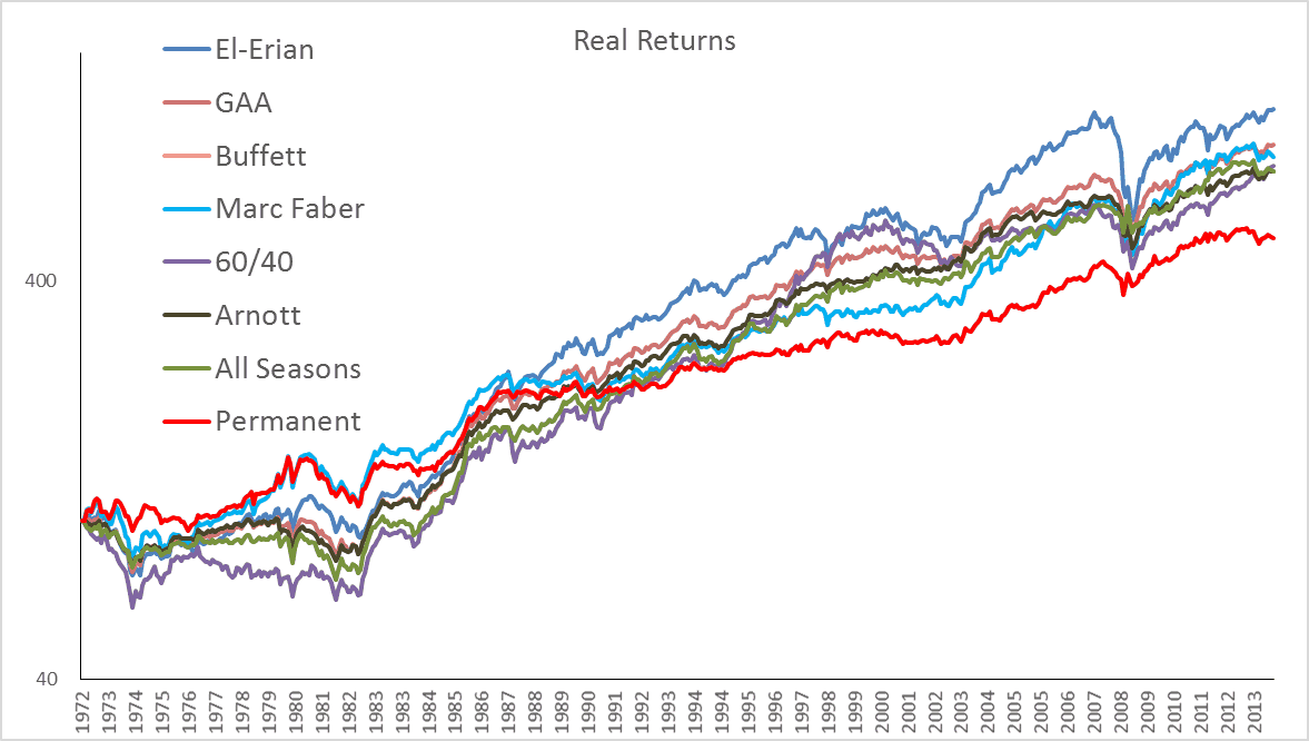
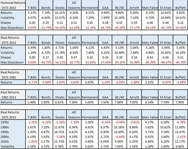
Most of the allocations moved together in a similar fashion. However, the allocations that performed the best in the inflationary 1970s then turned around and performed the worst in the disinflationary period to follow. Also not surprisingly, the Buffett and 60/40 allocations, with a lack of real assets, performed the worst during the inflationary 1970s. Even with the difference in allocations, the spread between the worst-performing allocation, the Permanent Portfolio at 4.12%, and the best, the El-Erian Portfolio at 5.67%, was only 1.84%. That is astonishing. If you exclude the Permanent Portfolio, all of the allocations are within one percentage point.
FIGURE 41 – Asset Class Returns, 1973-2013
Source: Global Financial Data
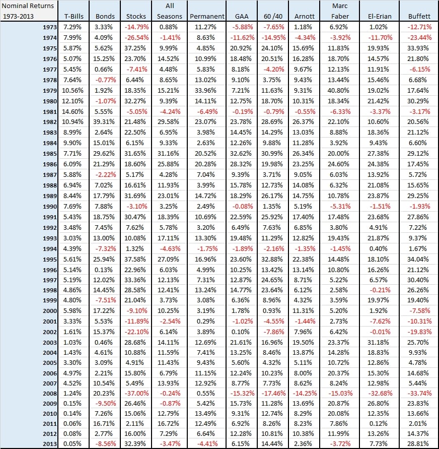
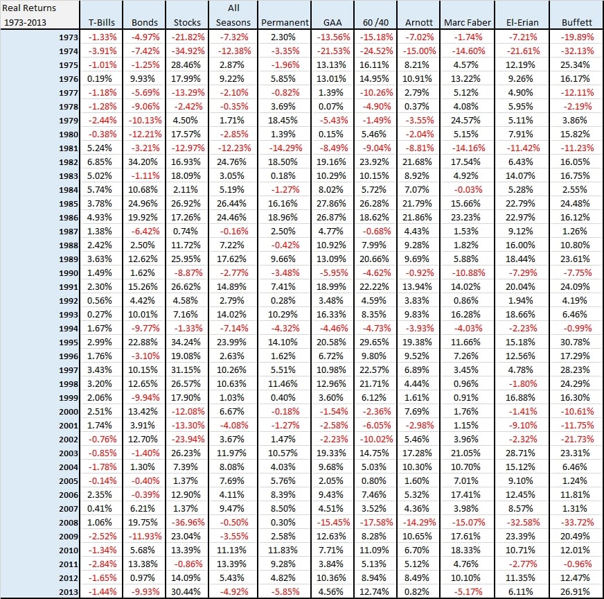
And just in case there are readers that want to see the year-by-year nominal and real returns, here they are.
FIGURE 42a – Asset Class Nominal Returns, 1973-2013
Source: Global Financial Data
FIGURE 42b – Asset Class Real Returns, 1973-2013
Source: Global Financial Data
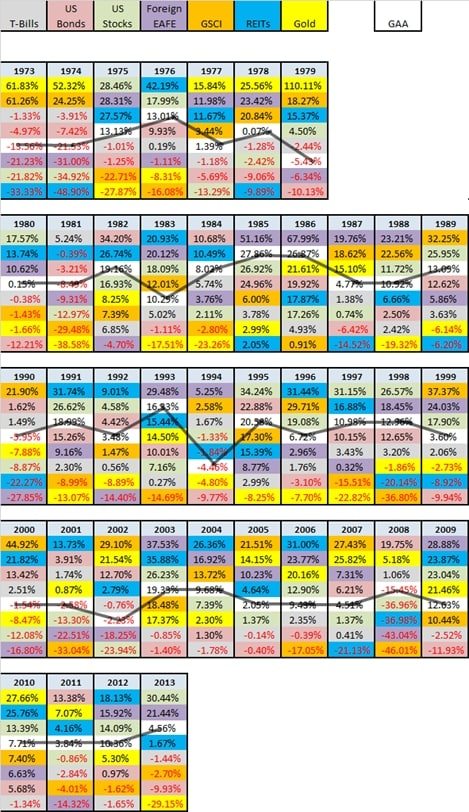
Another way of visualizing the benefits of a simple asset allocation is to generate what is called a periodic table of returns – an obvious nod to the Periodic Table of Elements. Below we construct a table of seven basic asset classes and the generic “GAA” asset allocation to prove a simple point. With a broad asset allocation you will never have the best returns of any asset class, but you will also never have the worst!
FIGURE 42c – Asset Class Real Returns, 1973-2013


