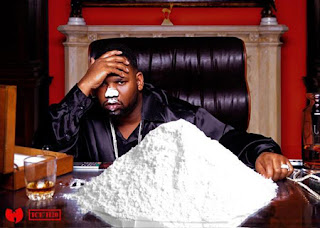
Inflation? Nahhhh. Even cocaine prices are up 24% this year. (That is a pic of Raekwon from Wu-Tang, whose new album drops in December.) Barry Ritholtz over at The Big Picture talks a lot about the CPI and how it is a poor indicator of inflation.
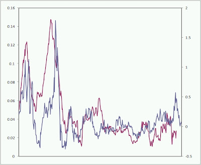
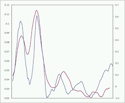
Below are two charts. The blue line is the 12 month % change in cash gold (moved forward 14 months). The red line is the 12 month % change in CPI. The second chart is the first chart with a 40 month moving average. As you can see, gold is pretty good at predicting inflation. (Sorry for the lack of labels, CPU is tweaking out.) The data is from 1970 – present. The longer term view is that CPI is going higher.
A nod to Tom McClellan for the logic behind this chart. (He runs the McClellan Market Reports service.)
—-
Speaking of blow (ups), here is a great article on the quant mess this Summer from the MIT Technology Review magazine. (Part 1 and Part 2.)
—-
Whenever it’s a slow day, I like to check out the posts on Ed Seykota’s FAQ.
—-
What is the Hinderburg Omen? Here is some more background. Does the fact that it has been firing off signals recently mean the end of this bull market is near?
—-


