Quick, before you read this post, ask yourself these questions:
1. What percentage of stocks beat their benchmark index over their lifetime?
2. What percentage of stocks have a negative return over their lifetime?
3. What percentage of stocks lose essentially all of their value?
Not sure? The answers to all three questions are below. Want to know why a monkey throwing darts is probably as good as your stockbroker? Read on.
I have been hounding the guys at BlackStar Funds to publish their research in a top academic journal for a long time now, but like most money managers, they are too busy conducting research and managing their funds to be concerned with publishing their research.
I have included some of their research in my upcoming book, and thankfully they finally agreed to do a guest post here. If you have any questions you can reach Eric and Cole directly at their website here or at info@blackstarfunds.com.
—-
The Capitalism Distribution – The Realities of Individual Common Stock Returns
by Eric Crittenden and Cole Wilcox, BlackStar Funds
(Download the PDF here)
When most people think of the stock market they do so in terms of index results. Popular indexes include the S&P 500 and the Russell 3000. However, most people are not aware of the tremendous differences between winning and losing stocks “beneath the hood” of a diversified index. From 1983 to 2006 over 8,000 stocks (due to turnover and delisting) were at some point members of the Russell 3000. The Russell 3000 Index measures the performance of the largest 3000 U.S. companies representing approximately 98% of the investable U.S. equity market. (Some Russell 3000 statistics here.)
Key findings:
39% of stocks had a negative lifetime total return
(2 out of every 5 stocks are money losing investments)
18.5% of stocks lost at least 75% of their value
(Nearly 1 out of every 5 stocks is a really bad investment)
64% of stocks underperformed the Russell 3000 during their lifetime
(Most stocks can’t keep up with a diversified index)
A small minority of stocks significantly outperformed their peers
(Capitalism yields a minority of big winners that all have something in common)
In this paper we make the case for the Capitalism Distribution, a non‐normal distribution with very fat tails that suggests a small minority of stocks have been responsible for virtually all the market’s gains while most stocks have been below average investments.
Our database covers all stocks that traded on the NYSE, AMEX, and NASDAQ since 1983, including delisted stocks. Stock and index returns were calculated on a total return basis (dividends reinvested). Dynamic point‐in‐time liquidity filters were used to limit our universe to the approximately 8,000 stocks that would have qualified for membership in the Russell 3000 at some point during their lifetime.
(Click on any chart to enlarge.)
Chart 1: Total Lifetime Returns for Individual U.S. Stocks, Jan-1-1983 to Dec-31-2006

The following chart shows the lifetime total return for individual stocks relative to the corresponding return for the Russell 3000. (Stock’s return from X‐date to Y‐date minus index return from X‐date to Y‐date.)
Chart 2: Total Returns of Individual Stocks vs. Russell 3000 Index, Jan-1-1983 to Dec-31-2006

The fat tails in this distribution are notable. 494 (6.1% of all) stocks outperformed the Russell 3000 by at least 500% during their lifetime. Likewise, 316 (3.9% of all) stocks lagged the Russell 3000 by at least 500%.
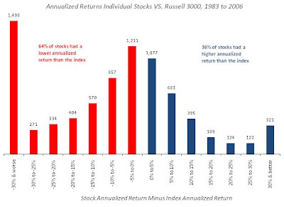
The next chart shows the lifetime annualized return for individual stocks relative to the corresponding annualized return for the Russell 3000. The left tail in this distribution is significant. 1,498 (18.6% of all) stocks dramatically underperformed the Russell 3000 during their lifetime.
Chart 3: Annualized Returns of Individual Stocks vs. Russell 3000, Jan-1-1983 to Dec-31-2006
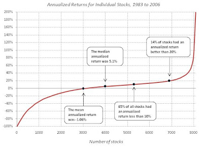
The next chart shows the cumulative distribution of the annualized return of all stocks. Notice that the average annualized return for all stocks is negative 1.06%.
Chart 4: Annualized Returns for Individual Stocks, Jan-1-1983 to Dec-31-2006
The next shows how stocks, when sorted from least profitable to most profitable contributed to the total gains produced from all stocks. The conclusion is that if an investor was unlucky enough to miss the 25% most profitable stocks and instead invested in the other 75% his/her total gain from 1983 to 2007 would be 0%. In other words, a minority of stocks are responsible for the majority of the market’s gains.
Chart 5: Attribution of Collective Return, Jan-1-1983 to Dec-31-2006

You may be wondering how the Russell 3000 index can have an overall positive rate of return if the average annualized return for all stocks is negative. The answer is partly a function of the index construction methodology. The Russell 3000 is market capitalization weighted. This means that successful companies (rising stock prices) receive larger weightings in the index. Likewise, unsuccessful companies (declining stock prices) receive smaller weightings. Eventually unsuccessful companies are removed from the index (delisted), making way for small but growing companies. In this way market capitalization weighted indexation is like a simple trend‐following system that rewards success and punishes failure.
It’s also important to point out that stocks with a negative annualized return had shorter life spans than their successful counterparts. The average life span of a losing stock was 6.85 years versus 9.23 years for winning stocks (many of which are still living right now), meaning that losing stocks have shorter periods of time to negatively impact index returns. For these reasons the average annualized return is probably a somewhat deceptive number for the purposes of modeling the “typical” stock, but interesting nonetheless.
The astute reader at this point is probably wondering if outperforming large capitalization stocks explain the observed distributions. Mathematically this would make sense. Small cap stocks certainly outnumber large cap stocks, while large cap stocks dominate the index weightings. However, while large cap stocks (Russell 1000) have outperformed small cap stocks (Russell 2000) over the long term it has been by less than 1% per year, hardly enough to explain our observations.
We identified the best performing stocks on both an annualized return & total return basis and studied them extensively. The biggest winning stocks on an annualized return basis had a moderate tendency to be technology stocks and most (60%) were bought‐out by another company or a private equity firm; not surprising.
Some of the biggest winners on a total return basis were companies that had been acquired. Examples include Sun America, Warner Lambert, Gillette, Golden West Financial and Harrah’s Entertainment. However, most (68%) are still trading today. Not surprisingly, they are almost exclusively large cap companies. However, further research suggests that they weren’t large companies when they were enjoying the bulk of their cumulative returns. Becoming a large cap is simply the natural result of significant price appreciation above and beyond that of the other stocks in the market. We were not able to detect any sector tendencies. The biggest winners on a total return basis were simply the minority that outperformed their peers.
Both the biggest winners on annualized return and total return basis tended to have one thing in common while they were accumulating market beating gains. Relative to average stocks they spent a disproportionate amount of time making new multi-year highs. Stock ABC can’t typically travel from $20 to $300 without first crossing $30 and $40. A stock that’s going from $20 to $300 is likely going to spend a lot of time making new highs. Likewise, the worst performing stocks tended to spend zero time making new multi-year highs while they were accumulating losses. Rather, relative to average stocks they tended to spend a disproportionate amount of time at multi‐year lows.
Mathematically it makes perfect sense. Stocks that generate thousands of percent returns will hit new highs hundreds of times, usually over the course of many years.

Could it be this simple; long term trend following on stocks? That’s our conclusion. For detailed results of the trading system that was inspired by this research see the paper, “Does trend following work on stocks?”
-Eric Crittenden and Cole Wilcox
—-
Meb’s note:
I mentioned their trendfollowing paper in my research paper as well as my book. It is a great example of a simple approach to risk management for investing in stocks. Setting a trailing stop ould have kept you from holding dogs like AIG, Bear Stearns (BSC), Lehman (LEH), Office Depot (ODP), Sears (SHLD), Beazer (BZH), and Citigroup (C) all the way into the ground. Not only does the system protect your portfolio, but it also saves you the emotional distress and uncertainty from watching Citigroup go from $50 to $5.

Ditto for historical blowups like Enron, WorldCom, Adelphia, and New Century Financial.

So what stocks are going up? A partial list of stocks near all time highs includes, gasp, some financials!
(Disclosure: Blackstar is probably long any stock that is near an all-time high.)
NuVasive (NUVA)
Flowers (FLO)
Stericycle (SRCL)
Heartland Express (HTLD)
Stanley (SXE)
Exponent (EXPO)
First Financial Bankshares (FFIN)
Laclede Gas (LG)
WGL Holdings (WGL)
New Jersey Resources (NGR)
Peoples Bank (PBCT)
Southside Bancshares (SBSI)
Trico Bancshares (TCBK)
UST (UST)
Allegiant Travel (ALGT)
Strayer Education (STRA)
Piedmont Natural Gas (PNY)
California Water Serv Group (CWT)
Emergent BioSolutions (EBS)

