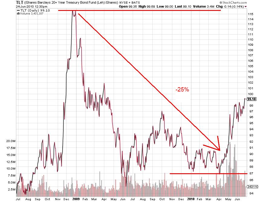
For those who are not familiar (according to the comments on the last post there are quite a few) with drawdowns, below is a chart of the long bond ETF that corresponds to the drawdown chart I posted. Note: The TLT chart is daily while the drawdown chart is monthly only data (the June 09 drawdown was more severe intra-month).
As you can see, an investor lost about 25% from the peak in Tbonds from 2009 – March 2010 before rallying significantly thereafter.
I hope that clears it up.


