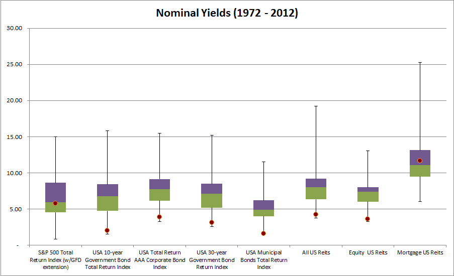
Below are two charts that I find highly useful. The first looks at yields on various indexes (the red dot is where we are now and purple/green represent one standard deviation bands). This chart poses the problem many investors complain about daily – where to find yield? (Note: S&P500 is TTM PE yield.)
One would conclude, that with the exception of mortgage REITs and US stocks, everything else is highly unnattractive. Bonds and REITs seem to be at their worst yields EVER.
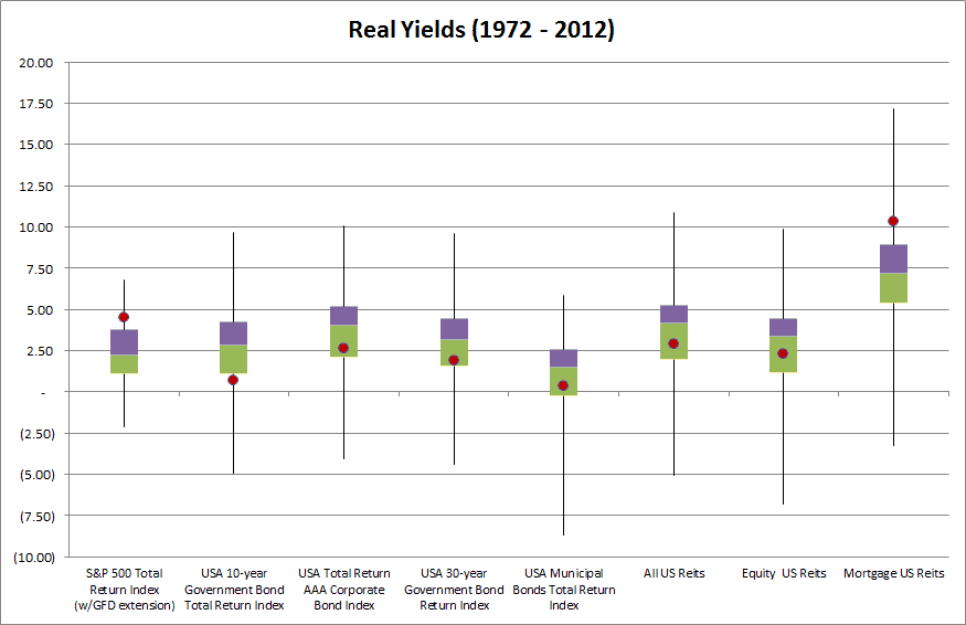
However, if one looks at yields after inflation, so called real yields, the picture changes. Most asset classes are in normal valuation ranges, and while bonds are still trading at low yields, stocks are even more attractive, and mortgage REITS too.
The world doesn’t look so bad. (HT: DJ.)


