The difficulty I have with a lot of indicators is just that, they are difficult. If I can’t understand what the chart is saying within a few seconds it is usually too confusing and often makes me think you’re trying to smash a square peg in a round hole.
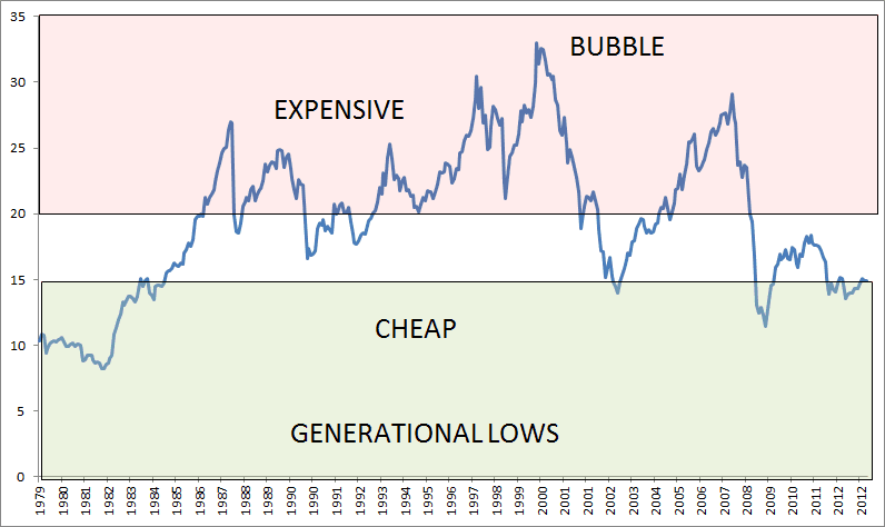
I’m not sure why I didn’t think of this before, but below is simply the average CAPE value across all countries since 1979. As you can see, it does a great job of setting up secular and cyclical lows in the markets…


