Below we have updated our 2006 white paper. While you can download the full 70+ page paper here, I’ve also chopped it up into a series of more digestible posts for the blog.
—-
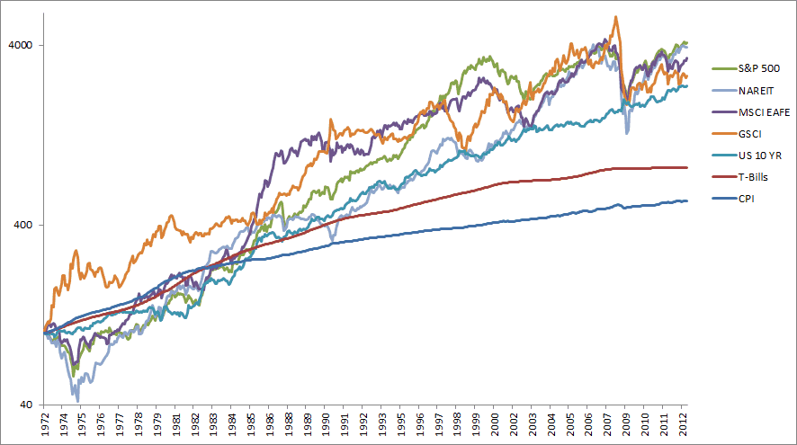
Modern portfolio theory holds that there is a tradeoff for investing in assets – you get paid to assume risk. Figure 3 shows the five asset classes that we will examine in this paper and their returns since 1973 (later in the paper we expand the study to include more asset classes.)
Unless otherwise noted all data series are total return series including dividends and income, and from Global Financial Data:
US Large Cap, S&P 500
Foreign Developed, MSCI EAFE
US 10-Year Government Bonds
Commodities, Goldman Sachs Commodity Index
Real Estate Investment Trusts, NAREIT Index
While the indexes traveled different routes from start to finish, most of the asset classes finished with similar returns over the time period. The exception was bonds, which trailed the other asset classes, an outcome that is to be expected due to their lower volatility and risk. The fact that bonds were even close in absolute performance to the other equity-like asset classes reflects the greater than twenty year bull market that took yields from double-digit levels to near 2% today.
Figure 3 – Asset Class Returns 1973-2012, Log Scale
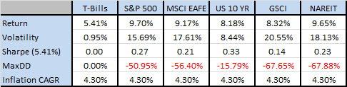
With US assets set to produce uninspiring returns, it makes a lot of sense to look at global assets as well as real assets to protect a portfolio from rising inflation. Figure 4 shows that, while these are some pretty nice returns for these asset classes historically, they are coupled with some large drawdowns. With the exception of U.S. government bonds, which declined less than 20%, the other four asset classes had drawdowns around 50% to 70%. If an investor were to include inflation or take the data back further, those drawdowns only get bigger. Higher resolution daily data and longer look back periods can only increase the drawdown amount. A good rule of thumb is that risky asset classes have Sharpe ratios that cluster around 0.20, while a diversified portfolio is around 0.40.
Figure 4 – Asset Class Maximum Drawdowns 1973-2012
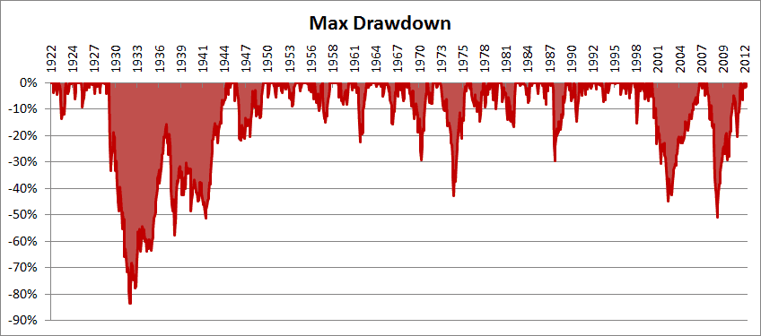
To give the reader a visual perspective of drawdowns, Figure 5 shows the drawdowns for stocks for the past 108 years. Drawdowns of 10%-20% are fairly frequent, with 30%-40% drawdowns less so. The large 1920s bear market dominates the figure with a drawdown over 80%.
Figure 5 – S&P 500 Drawdowns, 1900-2012
The former manager of the Harvard endowment, Mohamed El-Erian stated inKiplinger’s in 2009, “Diversification alone is no longer sufficient to temper risk. In the past year, we saw virtually every asset class hammered. You need something more to manage risk well.”
This paper examines a very simple quantitative market-timing model that manages risk. This trend-following model is examined on the U.S. stock market since 1900 before testing across four other markets. The attempt is not to build an optimization model, but rather to build a simple trading model that works in the vast majority of markets. The results suggest that a market timing solution is a risk-reduction technique that signals when an investor should exit a risky asset class in favor of risk-free investments. Instead of offering a lengthy review of the momentum and trendfollowing literature here, the material is included in the Appendix.
The approach is then examined in an allocation framework since 1973 where the empirical results are equity-like returns with bond-like volatility and drawdown. Later in this update we also examine other extensions including alternate allocations, cash management strategies, and more asset classes.