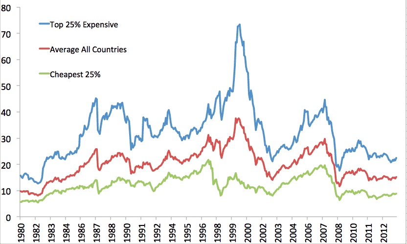
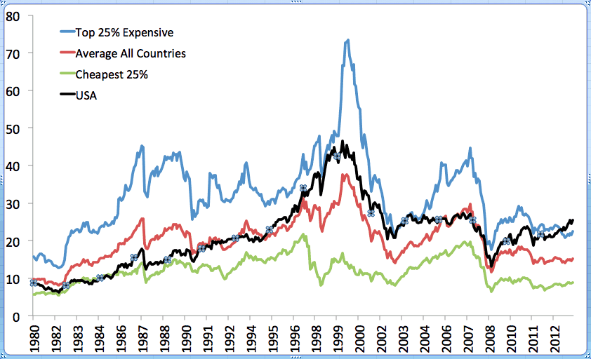
I was trying to do everything to avoid going to the gym last nite so I put together this chart. 25% cheapest, 25% most expensive, and average of all countries and their CAPE valuations. 2nd chart includes the US. It’s almost like a valuation Bollinger Band that could be used to adjust your domestic vs. global stock weightings.
Look at the only times the US has been at or near the bottom 25% – the early 80s (start of greatest bull in US) and perhaps 2009. Now? Above the highest 25%!
Right now, your allocation would be very heavy globally in markets that are broadly very cheap.