This excerpt is from the book Global Asset Allocation now available on Amazon as an eBook. If you promise to write a review, go here and I’ll send you a free copy. It is also available as a printable PDF on Gumroad. To celebrate the launch of the new book, my last two ebooks (Global Value and Shareholder Yield) are free on Amazon for five days ending March 6th …
——
Let’s start with a history lesson. Many people begin investing their money without a true understanding of what has happened in the past, and often bias their expectations toward their own personal experiences. My mother always told me the way to invest was to buy some stocks and then just hold on to them. But her experience, living in the United States and investing particularly in the 1980s and 1990s, was very different from her parent’s generation, which lived through the Great Depression. Both of these experiences would be vastly different from those of the average Japanese, German, or Russian investor.
So what is possible and reasonable to expect from history? We should begin with a discussion about the value of money.
A few years ago, my father and I were talking and he decided to demonstrate a real world example of inflation. A couple weeks later, I received a letter with a check inside written by my great grandfather in the 1910s for $0.50. He was a farmer who immigrated from Les Martigny-Baines, Voges France and ended up in Nebraska. That $0.50 is equivalent to about $13 today and shows a very simple example of inflation. As a side note, look at that penmanship!
FIGURE 1 – Real World Inflation

Source: Faber
A more familiar example is the oft-used phrase, “I remember when a Coca-Cola cost ten cents.” (Another fun example is “Superhero Inflation.”) Inflation is an emotional topic. It usually goes hand-in-hand with a discussion of The Federal Reserve, and there are not many topics that incite more vitriol in certain economic and political precincts than “The Fed” and the U.S. dollar.
One of the most famous charts in all of investing literature is the one below that illustrates the U.S. dollar’s purchasing power since the creation of The Federal Reserve in 1913. The description usually goes along the lines of this ZeroHedge post:
“This is the chart they don’t want you to see: the purchasing power of the dollar over the past 76 years has declined by 94%. And based on current monetary and fiscal policy, we have at least another 94% to go. The only question is whether this will be achieved in 76 months this time.”
The above statement is factually true – $1.00 in 1913 is only worth about three cents in current dollars due to the effects of inflation (which have averaged about 3.2% a year). But that is all the chart tells you – the U.S. has had mild inflation this century (with fits of disinflation, deflation, and high inflation mixed in):
FIGURE 2 – U.S. Dollar Purchasing Power, 1913-2014
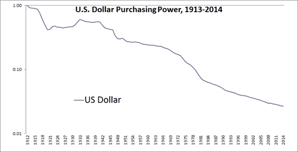
Source: Global Financial Data, Shiller
The chart is then used to justify any number of arguments and conclusions, usually laden with exclamation points!!!, bold text, and CAPITALIZATIONS. Cries to end the Fed, buy gold, sell stocks, and build forts stocked with guns, food, and ammunition usually follow in a stream of rants and raves. These articles are written like this for a reason. They elicit an emotional response (who doesn’t enjoy grumbling about the government?) and they certainly make for great headlines.
The problem that most miss is that investors have to do something with those dollars. Pretend you were an investor in 1913. You could choose to put your dollars under a mattress, in which case your purchasing power would decline as indicated in the chart above. You could also spend the money on consumption, such as vacations, entertainment, clothes, or food. Or you could invest in Treasury bills, in which case the dollar was a perfectly fine store of value, and your $1 would be worth $1.33 today (for a real return of about 0.26% per year).
So you didn’t really make any money, but you were not losing any either.
Note that “real returns” refer to the returns an investor receives after inflation. If an investment returned 10% (what we call nominal returns) but there was inflation of 2% that year, the real return is only 8%. Real returns are a very important concept as they make comparisons across timeframes more relevant. A 10% return with 8% inflation (2% real) is very different than a 10% return with 2% inflation (8% real). It is helpful to think about real returns as “returns you can eat.” That $1 Coke likely costs about the same as the $0.10 Coke, you are just paying with inflated dollars (and probably getting corn syrup instead of real sugar).
If you had decided to take on a little more risk, you could have invested in longer duration bonds, corporate bonds, gold, stocks, housing, or even wine and art—all of which would have been better stores of value than your mattress.
Figure 3 shows the real returns of stocks, bonds, and bills. While $1 would be worth only three cents had you put your hard-earned cash under the mattress, it would be worth $1.33 had you invested in T-bills, worth $5.68 in 10-Year Treasury bonds, and worth a whopping $492 in U.S. stocks.
FIGURE 3 – Purchasing Power, 1913-2014
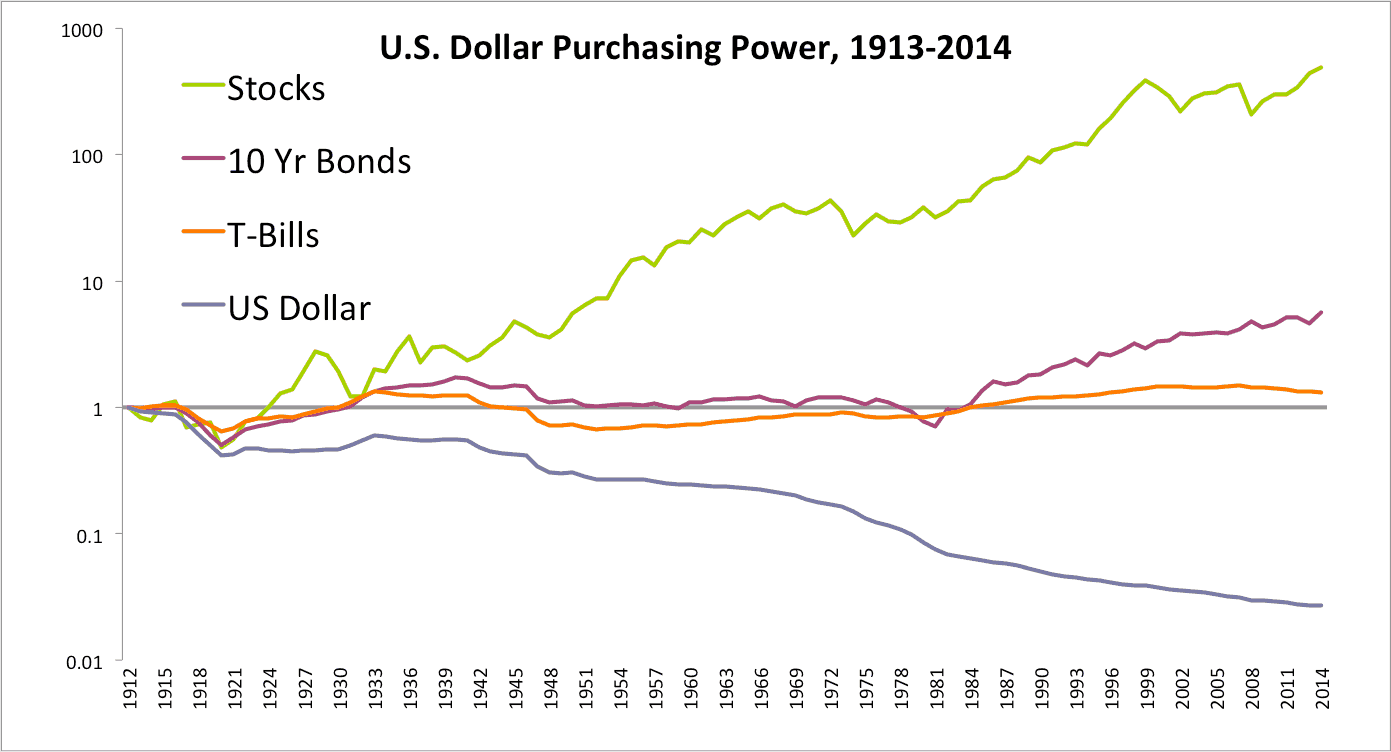
Source: Global Financial Data, Shiller
For those looking for a beautiful coffee table book on the topic of historical market returns, check out my all-time favorite investing book, Triumph of the Optimists: 101 Years of Global Investment Returns. (There are also free yearly updates of the book from Credit Suisse here. All of the yearly updates are highly recommended.) This fantastic book illustrates that many global asset classes in the twentieth century produced nice gains in wealth for individuals who bought and held those assets for generation-long holding periods. It also shows how the assets went through regular and painful drawdowns like the Global Financial Crisis of 2008.
Unfortunately for investors, there are only two states for your portfolio – all-time highs and drawdowns. Drawdowns for those unfamiliar are simply the peak to trough loss you are experiencing in an investment. So if you bought an investment at 100 and it declines to 75, you are in a 25% drawdown. If it then rises to 110, your drawdown is then 0 (all-time high).
For some long-term perspective, set forth below are some charts based on data from the book Triumph of the Optimists (available through Morningstar as the Dimson, Marsh, and Staunton module but requires a subscription). They represent the best-, middle-, and worst-case scenarios for the main asset classes of sixteen countries from 1900-2014. They have since updated their database to include 23 countries with results in the Credit Suisse reference link above. All return series are local real returns and displayed as a log graph (except the last one). U.S. dollar based returns are near identical.
First, here are the best-, middle-, and worst-cases for returns on your cash.
Figure 4 shows that leaving cash under your mattress is a slow bleed for a portfolio. Germany is excluded after the first series as it dominates the worst-case scenarios (in this case, hyperinflation). Inflation is a major drag on returns. When it gets out of control, it can completely wipe out your cash and bond savings. So you mattress stuffers – on average you would have lost about 4% a year by keeping your money at home.
FIGURE 4 – Cash Real Returns, 1900-2014
Best-Case: -2.2% per year
Middle: -3.9%
Worst-Case: -100%
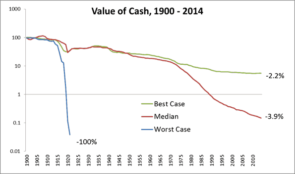
Source: Morningstar, Elroy Dimson, Paul Marsh, Mike Staunton, Triumph of the Optimists, Princeton University Press, 2002, Credit Suisse Global Investment Returns Sourcebook 2015
Next up are real returns for short-term government bills. These instruments do all they can just to keep up with inflation. You’re not usually going to make any money, as Figure 5 shows, but at least they don’t lose 4% a year like the mattress does. We also include the “World” which is the global market capitalization weighted portfolio which weights the portfolio based on size of each country’s stock market.
FIGURE 5 –Short-term Government Bills Real Returns, 1900-2014
Best-Case: 2.1% per year
Middle: 0. 7%
Worst-Case: -3.5% (Real Worst-Case, Germany -100%)
World: 0.9%
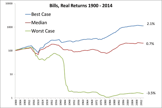
Source: Morningstar, Elroy Dimson, Paul Marsh, Mike Staunton, Triumph of the Optimists, Princeton University Press, 2002, Credit Suisse Global Investment Returns Sourcebook 2015
In Figure 6, adding a little duration risk doubles the historical returns of bills for our 10-year bonds, but that is still a pretty small return. You’re not going to get rich with 1.7% real returns, and you still have to sit through a 50% drawdown, as we will show later.
FIGURE 6 –Long-term Government Bonds Real Returns, 1900-2014
Best-Case: 3.3% per year
Middle: 1.7%
Worst-Case: -1.4% (Real Worst-Case, Germany -100%)
World: 1.9%
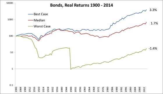
Source: Morningstar, Elroy Dimson, Paul Marsh, Mike Staunton, Triumph of the Optimists, Princeton University Press, 2002, Credit Suisse Global Investment Returns Sourcebook 2015
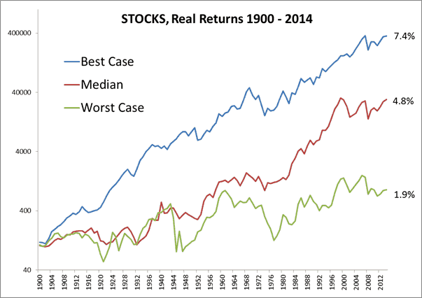
And finally, we have the real returns for stocks. Much better! Over 4% real returns per year is far superior to returns of the bond market. While these are great returns, realize that it would still take over 15 years to double your money!
FIGURE 7 –Stocks Real Returns, 1900-2014
Best-Case: 7.4% per year
Middle: 4.8%
Worst-Case: 1.9%
(Real Worst-Case, China, Russia -100%)
World: 5.2%

Source: Morningstar, Elroy Dimson, Paul Marsh, Mike Staunton, Triumph of the Optimists, Princeton University Press, 2002, Credit Suisse Global Investment Returns Sourcebook 2015
And in Figure 7a, the same chart is presented with a non-log y-axis. We do this to demonstrate to readers the importance of viewing charts that have percentage changes over long time frames with a log axis. Otherwise the chart is almost unreadable and definitely not useful. Perhaps importantly, you can now distinguish between unscrupulous money managers advertising their services with the below style of chart which can be misleading, as the gains look much more dramatic.
FIGURE 7a–Stocks Real Returns, 1900-2014, Non-log Axis
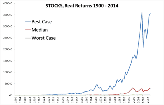
Source: Morningstar, Elroy Dimson, Paul Marsh, Mike Staunton, Triumph of the Optimists, Princeton University Press, 2002, Credit Suisse Global Investment Returns Sourcebook 2015
Let’s look at the entire series across all countries to visualize some of the best and worst-case scenarios. It looks like a simple conservative rule of thumb may be to expect stocks to return around 4% to 5%, bonds 1% to 2%, and bills basically zero. Note that the United States had one of the best performing equity and bond markets for the 20th Century.
FIGURE 8–Asset Class Real Returns, 1900-2014
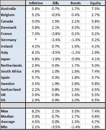
Source: Morningstar, Elroy Dimson, Paul Marsh, Mike Staunton, Triumph of the Optimists, Princeton University Press 2002, Credit Suisse Global Investment Returns Sourcebook 2015
One would think that the math above would make the decision easy – just put all your money in stocks! While stocks outperformed the returns of bonds and bills, stocks are not without their own risks. At least two countries had their equity markets wiped out when the government shut down the capital markets. No wonder people are so wary of investing in Russia and China even today.
Another risk is that stocks can go for a really long time underperforming other asset classes, such as bonds. It is easy to look at the data and assume you can wait out any stock market underperformance—at least until it happens to you.
In his 2011 “The Biggest Urban Legend in Finance,” Rob Arnott discusses a 30-year underperformance of stocks vs. bonds:
“A 30-year stock market excess return of approximately zero is a huge disappointment to the legions of “stocks at any price” long-term investors. But it’s not the first extended drought. From 1803 to 1857, U.S. equities struggled; the stock investor would have received a third of the ending wealth of the bond investor. Stocks managed to break even only in 1871. Most observers would be shocked to learn there was ever a 68-year stretch of stock market underperformance. After a 72-year bull market from 1857 through 1929, another dry spell ensued. From 1929 through 1949, stocks failed to match bonds, the only long-term shortfall in the Ibbotson time sample. Perhaps it was the extraordinary period of history—The Great Depression and World War II—and the spectacular aftermath from 1950–1999, that lulled recent investors into a false sense of security regarding long-term equity performance.”
A 68-year long stock underperformance is almost the same as a human’s current expected lifespan in the U.S. Bonds outperformed stocks over an entire lifetime (really, more than a lifetime, since life expectancy in the 1800s was around 40 years in the U.S.). When talking about stocks for the long run, then, it must mean something other than a human lifetime. For a tortoise, deep sea tubeworm, or sequoia tree perhaps? To be fair, the longer you go back in history the more suspect the data is, so we confine our analysis below to the post 1900 period.
Other countries experienced large drawdowns, and even in the United States, an investor lost about 80% from the peak in the 1929-1930s stock bear market. The unfortunate mathematics of a 75% decline requires an investor to realize a 300% gain just to get back to even – the equivalent of compounding at 4.8% for 30 years! Even a smaller 50% drawdown would require 15 years at that rate of return to get back to even.
Large drawdowns are why many people choose to invest in bonds, but bonds are risky too. While stocks typically suffer from sharper price declines, bonds often have their value eroded by inflation. The U.S. and the U.K. have both seen real bond drawdowns of over 60%. While that sounds painful, in many other countries (Japan, Germany, Italy, and France), it was worse than 80%. Some countries that faced hyperinflation resulted in a total loss, and Business Insider has a slideshow that examines a few of the worst examples in the past 100 years.
Figure 9 shows that both stocks and bonds have had multiple large drawdowns over the years. The first chart uses monthly data (we don’t have monthly for the U.K.), and monthly data only increases the drawdown figure.
FIGURE 9 –Asset Class Real Drawdowns, 1900-2014
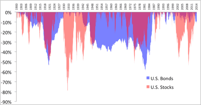
Source: Morningstar, Bloomberg, Elroy Dimson, Paul Marsh, Mike Staunton, Triumph of the Optimists, Princeton University Press 2002
The same principle occurs in the U.K., but bond investors had to wait even longer to get back to even – almost 50 years! Below is Figure 10 looking at yearly real returns and drawdowns.
FIGURE 10 –Asset Class Real Drawdowns, 1900-2014
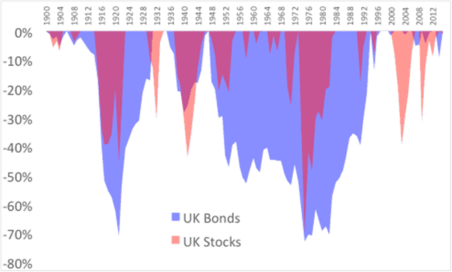
Source: Morningstar, Bloomberg, Elroy Dimson, Paul Marsh, Mike Staunton, Triumph of the Optimists, Princeton University Press 2002
This is one of the problems with investing in just one security, country, or asset class. Normal market returns are extreme. Individuals invested in various assets at specific periods—U.S. stocks in the late 1920s and early 1930s, German asset classes in the 1910s and 1940s, Russian stocks in 1917, Chinese stocks in 1949, U.S. real estate in the mid-1950s, Japanese stocks in the 1990s, emerging markets and commodities in the late 1990s, and nearly everything in 2008— would reason that holding these assets was a decidedly unwise course of action. Most individuals do not have a sufficiently long time to recover from large drawdowns from any one risky asset class.
So what is an investor to do? The next step lies in what is called the only free lunch in investing – diversification.