This excerpt is from the book Global Asset Allocation now available on Amazon as an eBook. If you promise to write a review, go here and I’ll send you a free copy. It is also available as a printable PDF on Gumroad.
—-
“I think the single most important thing that you can do is diversify your portfolio.”
–Paul Tudor Jones, Founder Tudor Investment Corporation
The next two questions and answers will likely surprise you.
Question 1 – Quick, what is the world’s largest financial asset class? Don’t know?
Answer: Foreign ex-U.S. bonds! This is usually surprising to most investors who assume the answer is U.S. stocks or bonds.
FIGURE 15 – The Largest Asset Class in the World
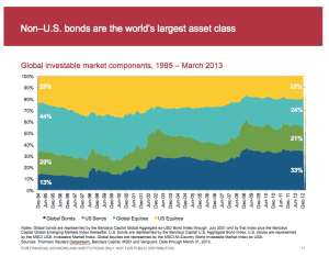
Source: Vanguard
Question 2: How much of your global stock allocation should be in the United States?
Answer: About half!
U.S. investors usually put around 70% of their stock allocation at home here in the U.S. This is called the “home country bias”, and it occurs everywhere. Most investors around the world invest most of their assets in their own markets. Figure 16 is a chart from Vanguard that details the “home country bias” effect in the U.S., the U.K., Australia, and Canada. The blue bars are how much investors should own of each country according to global weightings, and the red bars are how much they actually own of their own country – way too much!
FIGURE 16 – Home Country Bias
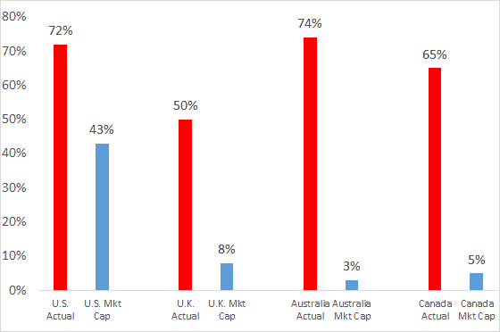
Source: Vanguard
Figure 17 is a chart from the Credit Suisse GIRY update we mentioned earlier. It details the U.S. as a percentage of world market capitalization (52%) in 2014. Given this, while most of us here in the United States invest 70% of our stock allocation in U.S. stocks, in order to be truly representative of the global marketplace it really should only be about half. Note that the U.S. was only 15% of world market cap back in 1899. As a share of global GDP, the U.S. is only 20% (emerging markets are 50% of global GDP, but only 13% of market capitalization).
FIGURE 17 – Stock Market Sizes, 1899 and 2014
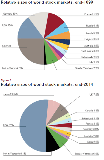
Source: Elroy Dimson, Paul Marsh, Mike Staunton, Triumph of the Optimists, Princeton University Press 2002, Credit Suisse Global Investment Returns Sourcebook 2015
The point of the two questions at the beginning of the chapter is that we live in a global world. There is no need to build an investment portfolio with just exposure to U.S. stocks and bonds. Figure 18 is another chart of how market cap weightings have changed over time. Notice the large Japanese bubble expansion in the 1980s and the rapid contraction afterward.
FIGURE 18 – Stock Market Sizes, 1900 to 2012
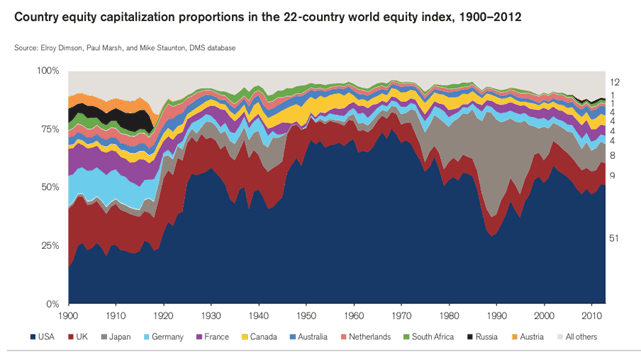
Source: Elroy Dimson, Paul Marsh, Mike Staunton, Triumph of the Optimists, Princeton University Press 2002, Credit Suisse Global Investment Returns Sourcebook
The key question for investors to ask, then, is, “What would our allocation look like if we expanded the 60/40 portfolio to include foreign stocks and bonds? Would that help improve our returns or reduce our risk?”
The Global 60-40 Portfolio
The next portfolio we will examine is the 60/40 portfolio, only now we are using global indices rather than just U.S. ones. We split the stock allocation into half domestic and half foreign developed stocks (MSCI EAFE), and split the bond allocation into half domestic and half foreign 10-year government bonds.
Going global in this illustration doesn’t change the end result too much, though it does increase returns, reduce volatility, and improve the Sharpe ratio (all good things). The global portfolio also did better during the inflationary 1973-1981 period, as Figure 19 shows.
FIGURE 19 – Various Assets and Strategies, Real Returns, 1973-2013
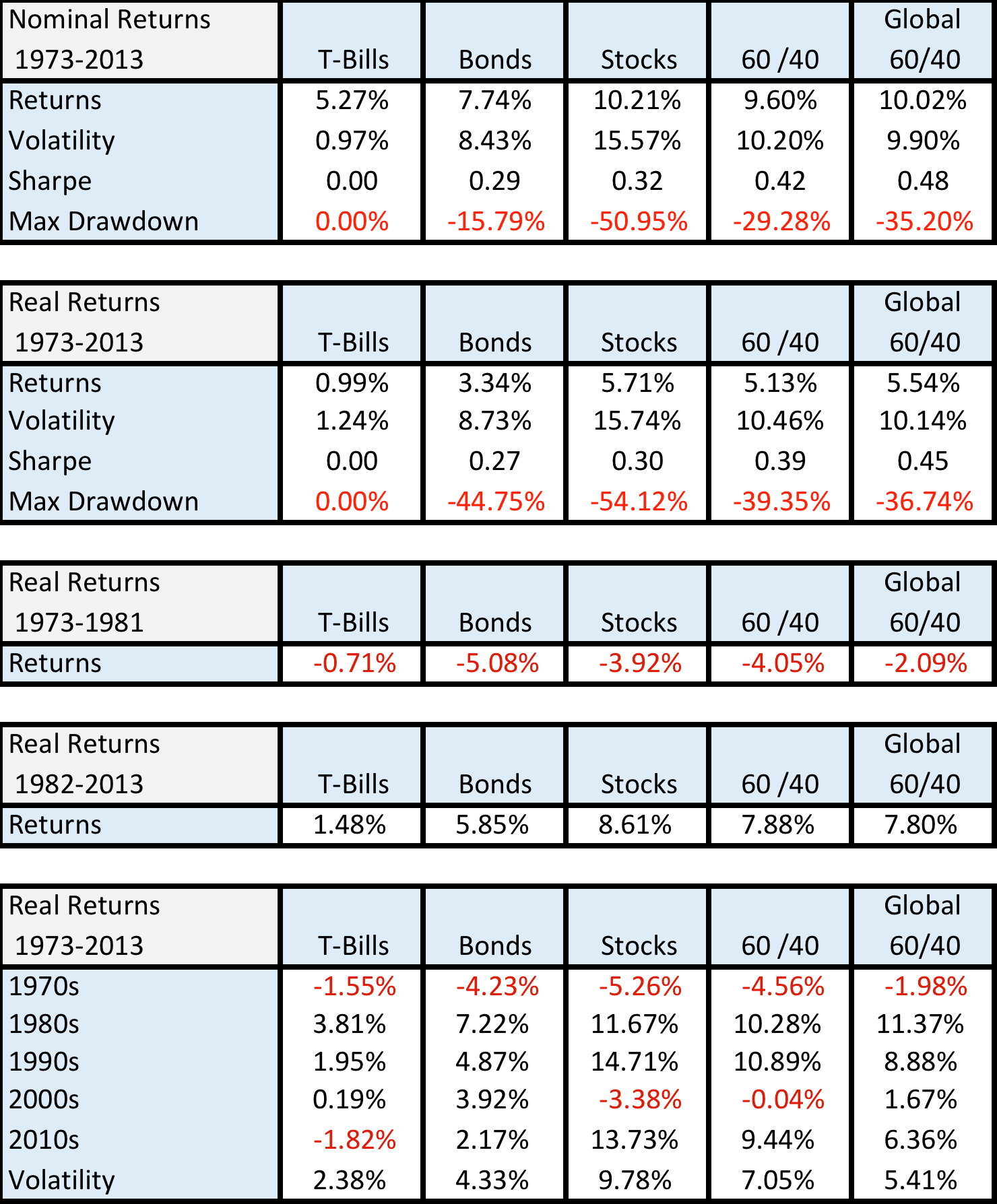
Source: Global Financial Data
Source: Global Financial Data
There is no reason, however for investors to focus exclusively on stocks and bonds. Would increasing amounts of granularity with additional asset classes help when looking at building a diversified portfolio? In this book, we are going to examine 13 assets and their returns since 1973. They are found in Figure 20 below with a column denoting what broad category of assets they fall under.
FIGURE 20 – Asset Classes
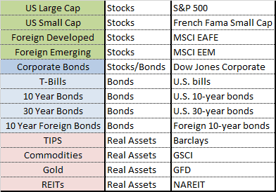
Are there other asset classes? Of course. However, many asset classes (or sub-asset classes) do not have sufficient histories to analyze, such as emerging market bonds. For those unfamiliar, REITS are publicly traded real estate investment trusts, and TIPS are U.S. Treasury inflation protected bonds.
We also exclude active approaches to investing even though we discuss some of these “tilts” in other white papers and books like Shareholder Yield. So while an active strategy like managed futures is one of my favorite investment strategies, we don’t include it in the building blocks section. (I like to call trendfollowing my “desert island” strategy if I had to pick one method to manage money for the rest of my life. While not the topic of this book, we have written a great deal about trend strategies on the blog as well as in the white paper “A Quantitative Approach to Tactical Asset Allocation.”)
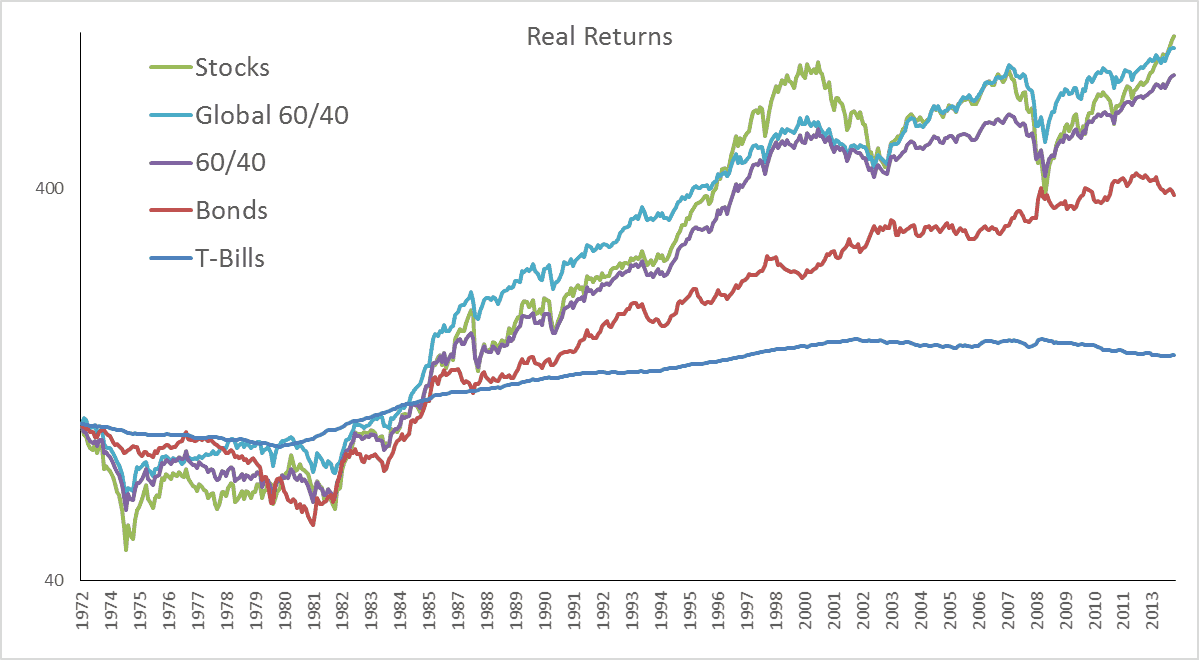
Figure 21 presents a chart of the asset classes we examine in the following chapters.
FIGURE 21 – Various Assets, Real Returns, 1973-2013
Source: Global Financial Data
We didn’t label the asset classes in the chart on purpose simply to demonstrate that while the indexes traveled different routes from start to finish, all of the asset classes finished with positive real returns over the time period. The fact that bonds were even close in absolute performance to the other equity-like asset classes reflects the greater than thirty-year bull market that took yields from double-digit levels to near 2% today. The below charts demonstrate the returns and risk characteristics of the various asset classes.
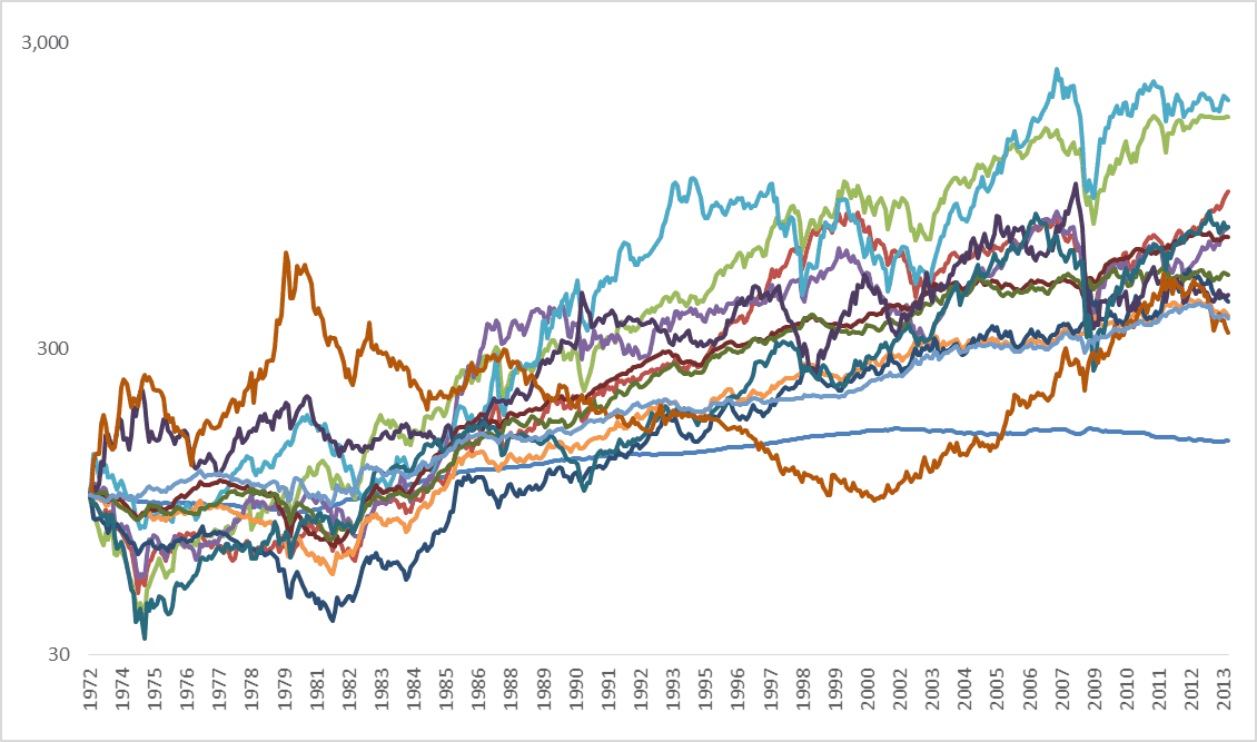
FIGURE 22 – Asset Class Nominal Returns, 1973-2013
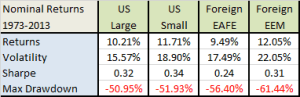
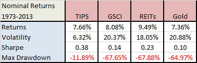

Source: Global Financial Data
While these are some pretty nice returns for these asset classes historically, they suffered through some large drawdowns.
Like we discussed before, nominal returns are illusory. You can’t spend or eat nominal returns. Below in Figure 23 are the same building blocks but with real returns. Stocks were in the ballpark of 5-7%, bonds 0-5%, and real assets 3-5%. (Corporate bonds share equity-like characteristics, so we characterize them as 50% stocks and 50% bonds for purposes later in the paper.)
FIGURE 23 – Asset Class Real Returns, 1973-2013
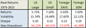

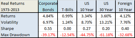
Source: Global Financial Data
If an investor were to take the data back further, or use daily data observations, those drawdowns only get bigger. It is a sad fact that as an investor, you are either at an all-time high with your portfolio or in a drawdown – there is no middle ground – and the largest absolute drawdown will always be in your future as the number can only grow larger. (Unless you went bankrupt of course as then the amount is a total loss. Sadly, Brazil’s richest man experienced this event when he lost over $30 billion – here is a good article on the topic with lots of lessons for individuals as well.)
One of the biggest challenges of investing is that any asset can have a long period of underperformance relative to other assets – or even outright negative returns and losses. Cliff Asness, co-founder of AQR Capital Management, has a fun piece out on his blog titled “Efficient Frontier “Theory” for the Long Run”, where he talks about five-year periods in stocks, bonds, and commodities and basically how anything can happen over short periods of time. (Although for many investors, five years can feel like a lifetime.)
Using the data in Figure 24, we examine returns during two periods, inflationary 1973-1981 and falling inflation/disinflation 1982-2013. We also look at asset returns by decade. The final line in the table is the volatility of decade returns. While there are only five observations its helps to demonstrate the decade level consistency.
What can we learn from these tables? All of our assets had positive real returns, which is what you want from investing in any asset.
Real returns were much harder to come by in the inflationary 1970s. Eight out of 13 asset classes had negative real returns in the 1970s. Gold, commodities, and emerging market stocks had the best performance. Everything was up big in the 1982-2013 timeframe, but gold and cash lagged the most as the transition from high interest rates and inflation led to growth, lower inflation, and lower still interest rates. The only asset classes that had positive performance in every decade were emerging markets and TIPS, although the TIPS category is not a completely fair comparison since they were only introduced in 1997 and therefore this is a synthetic series that investors could not have allocated to at the time.
FIGURE 24 – Asset Class Returns, 1973-2013
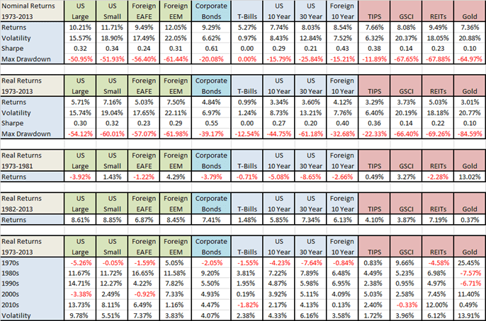
Source: Global Financial Data
While there are certainly hundreds of different portfolios one can construct from our 13 assets, we are going to focus on just a handful of allocations below. (More “lazy portfolio” ideas here.)
These allocations have been proposed by some of the most famous money managers in the world, collectively managing hundreds of billions of dollars. We included a few other portfolios worthy of mention in the Appendix, but excluded them from the body of the text to keep things simple. Otherwise this book could have easily been 300 pages and the goal is not to put you to sleep but rather let you finish in one sitting and get on with your life.
The flow of the chapters will range from the portfolios that allocate the most to bonds to the ones that allocate the least.
Let’s get started!