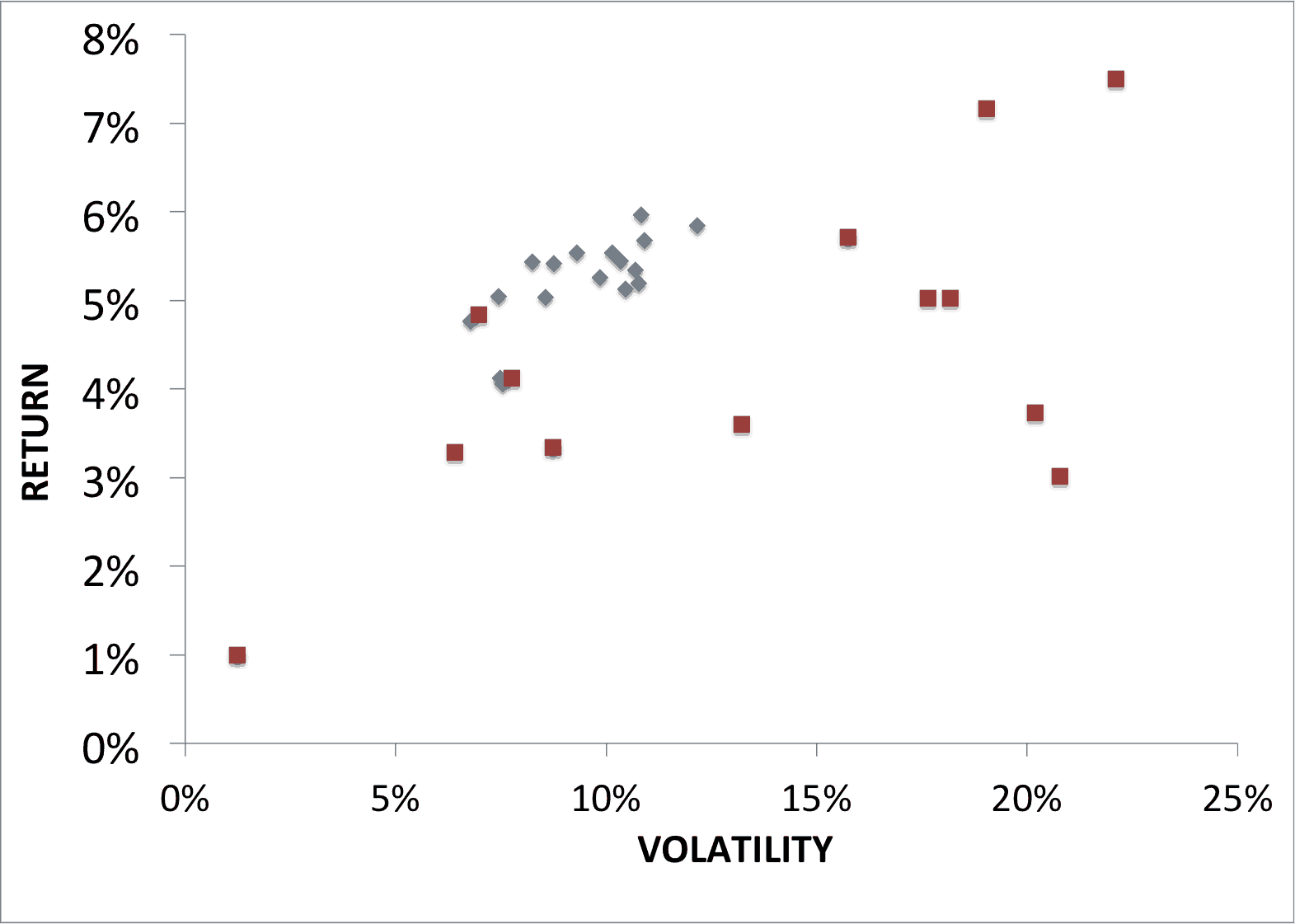
Not sure why I didn’t include this chart in my Global Asset Allocation book, but below is the basic return/vol chart. It demonstrates how clustered the returns are. If you exclude the permanent portfolio (high cash), they are all within 1 percentage point of each other! Red are assets, blue portfolios. 73-2014.


