I wrote an article a few months ago on global valuations (we just updated the valuation metrics for 44 countries and sectors on The Idea Farm). The cheapest countries didn’t disappoint in the first quarter with strong returns, led by the cheapest market in the world at the time (Brazil).
But no one wanted to invest in Brazil (and many still don’t). Why? The news is terrible. I just Googled “Brazil” and here are the top headlines from News:
Insider’s Account of How Graft Fed Brazil’s Political Crisis
Why tickets are not selling for the summer Olympics
Brazil Impeachment: The Process for Removing the President
Dengue Outpaces Zika in Brazil
Brazil: economic collapse worse than feared
Cheap valuations almost always come with terrible newsflow. And cheap valuations almost always come with large losses in stocks.
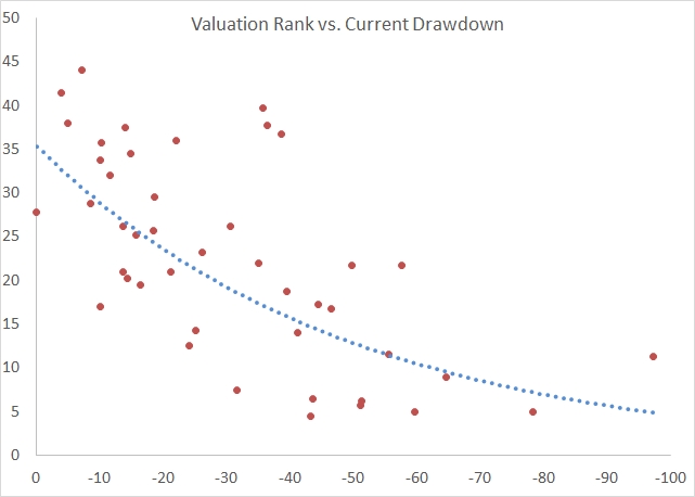
Below is a chart that demonstrates our country stock ranking of 44 countries on long-term valuation metrics. A lower value represents the cheapest countries, and higher is more expensive. The X axis is simply how far away from all time highs that market is (maximum drawdown, measured as local real returns). So, 0% means the market is near or hitting new highs (like New Zealand and the US), whereas -50% means the stock market is down by half.
Notice anything about the chart? There seems to be a pretty decent correlation between value rank and market losses. After all, it usually takes a large price decline for markets to get cheap. If earnings are stable, a normally valued market at 18 needs to get cut in half to get down to a value of 9. But who wants to buy a market down 50%?!
I do.
Here is a chart from PIMCO/Research Affiliates that shows the future 5-year return to markets when they decline below a CAPE ratio of 10…17% per year returns! Currently we show four markets trading below a CAPE of 10, and a whopping 14 trading below a value of 12.


