I get most of my quant research done while trying to avoid other less interesting work. So I was curious when I saw my friend John Hussman writing about an obscure technical indicator called the Coppock Curve. I filed it away as “interesting”, sent it to the Idea Farm list, then moved on. But they Barry was asking me about it so that got me curious again, and I wanted to see what it might be saying for global assets too.
Here’s a summary from John’s post:
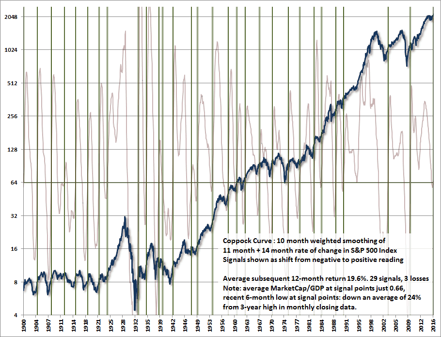
“After nearly two years of flat market action at the third highest level of valuation in history, next to 1929 and 2000, the Coppock Curve turned positive this month, prompting enthusiasm among some market technicians. Though we don’t use the Coppock indicator in its popular form, the 29 signals in this measure since 1900 have been associated, on average, with market returns of 19.6% over the following year, and only 3 yearly losses among those signals (one because of the entry into World War II, and the others because the signals were driven by the reversal of a very weakly negative reading, as was the case for the latest signal). The chart below shows this history. The very light purple line is the Coppock curve, and positive signals are identified by the vertical green lines.”
Here’s a brief, but very interesting overview from Wikipedia. (note in particular the comment about mourning which I’ve referenced as to how long it takes investors to get over bear market emotional damage.)
The Coppock curve or Coppock indicator is a technical analysis indicator for long-term stock market investors created by E.S.C. Coppock, first published in Barron’s Magazine on October 15, 1962.[1]
The indicator is designed for use on a monthly time scale. It is the sum of a 14-month rate of change and 11-month rate of change, smoothed by a 10-period weighted moving average.
.
Coppock, the founder of Trendex Research in San Antonio, Texas, was an economist. He had been asked by the Episcopal Church to identify buying opportunities for long-term investors. He thought market downturns were like bereavements and required a period of mourning. He asked the church bishops how long that normally took for people, their answer was 11 to 14 months and so he used those periods in his calculation.[2]
A buy signal is generated when the indicator is below zero and turns upwards from a trough. No sell signals are generated (that not being its design). The indicator is trend-following, and based on averages, so by its nature it doesn’t pick a market bottom, but rather shows when a rally has become established.
Coppock designed the indicator (originally called the “Trendex Model”[1]) for the S&P 500 index,[citation needed] and it has been applied to similar stock indexes like theDow Jones Industrial Average. It is not regarded as well-suited to commodity markets, since bottoms there are more rounded than the spike lows found in stocks.[3]
A million years ago I was going to write a white paper on the Coppock Curve, and just never got around to it. So, on the plane back from Chicago I thought I’d apply it to some global assets and see what the results were. And interestingly enough, they were quite good (one year future returns):
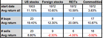
The caveat for US stocks of course is valuation. We’re at a CAPE ratio of 26 now, which is a higher value than any of the Coppock buy signals (which have averaged a CAPE of 14.) If you sorted the buys by CAPE ratio, the cheaper half outperforms the more expensive half by 6 percentage points. So, perhaps one could expect a muted signal.
Though, to be clear, my data actually doesn’t show a buy signal yet as my #s never went negative. ¯\_(ツ)_/¯
Anyways, Stockcharts has the ability to chart Coppock, and even an Excel download if you want to go play with the formula yourself. I built a darn simple system (long when Coppock positive, in bonds otherwise….and it works great!)
Let me know what else you may find!