This excerpt is from the book Global Asset Allocation now available on Amazon as an eBook. If you promise to write a review, go here and I’ll send you a free copy. It is also available as a printable PDF on Gumroad.
——
“No strategy is so good that it can’t have a bad year or more. You’ve got to guess at worst cases: No model will tell you that. My rule of thumb is double the worst that you have ever seen.” – Cliff Asness , Co-founder AQR Capital Management
The most venerable asset allocation model is the traditional 60/40 portfolio. The portfolio simply invests 60% in stocks (S&P 500) and 40% in 10-year U.S. government bonds. We will use this portfolio as the benchmark to compare all of the following portfolios in this book.
The reason many people will invest in both stocks and bonds is that they are often non-correlated, meaning, stocks often zig while bonds zag. While the relationship isn’t constant, combining two or more non-correlated assets into a portfolio results in a better portfolio than just either alone.
How has this portfolio performed? Let’s look at the U.S. 60/40 portfolio back to 1913, rebalanced monthly. We consider volatility to be measured by the standard deviation of monthly returns. The Sharpe ratio is a measure of risk adjusted returns, and is calculated as: (returns – risk free rate)/volatility. The risk-free rate is simply the return of Treasury bills. A higher Sharpe ratio is better, and a good rule of thumb is that risky asset classes have Sharpe ratios that cluster around the 0.20 to 0.30 range.
FIGURE 11 –Asset Class Real Returns, 1913-2013

Source: Global Financial Data
So it looks like you get a nice diversification benefit of investing your portfolio in both assets. While 60/40 doesn’t quite achieve the returns of stocks, you reduce your drawdown a bit due to the assets not being perfectly correlated. Figure 12 shows the equity curve of the strategy.
FIGURE 12 –Asset Class Real Returns, 1913-2013
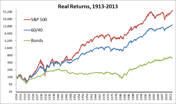
Source: Global Financial Data
One challenge for investors is how much time they spend in drawdowns. It is emotionally challenging, largely, since we anchor to the highest value a portfolio has attained. For example, if your account hit $100,000 last month up from $20,000 twenty years ago, you likely think of your wealth in terms of the recent value and not the original $20,000. If it then declines to $80,000, most will think in terms of losing $20,000 rather than the long-term gain of $60,000. The 60/40 allocation only spends about 22% of the time at new highs, and the other 78% in some degree of drawdown. Drawdowns are physically painful, and the behavioral research demonstrates that people hate losing money much more than the joy of similar gains. To be a good (read: patient) investor you need to be able to sit through the dry spells.
So why not just allocate to the 60/40 portfolio and avoid reading the rest of this book?
While 60/40 is a solid first step, we posit that focusing solely on U.S. stocks and bonds is a mistake. In fact, this 60/40 approach presents a particularly difficult challenge to investors at the end of 2014, as we detail below.
U.S. stocks have returned a meager 4.9% per year from 2000 – 2014 and, factoring in inflation, have returned 1.90% per year, provided investors had the ability to sit through two gut-wrenching bear markets with declines of over 45%. According to recent DALBAR studies, many have not. 1.9% per year is a far cry from the historical 6.47% that U.S. stocks have returned over the full period from 1900-2014.
One of the reasons for the subpar returns is simple – valuations matter. The price you pay influences your rate of return. Pay a below average price and you can reasonably expect an above average return, and vice versa. Valuations started the 2000s at extreme levels. The ten-year cyclically adjusted price-to-earnings (CAPE) ratio for U.S. stocks reached a level of 45 in December 1999, the highest level ever recorded in the U.S., as Figure 13 shows. (For those unfamiliar with valuation methods for stocks, we examine over 40 global stock markets and how to use global valuation metrics in our book Global Value.) This high starting valuation set the stage for very poor returns going forward for investors buying stocks in the late 1990s.
Figure 13 – Ten-Year Cyclically Adjusted Price-to-Earnings Ratio (CAPE), 1881- 2014
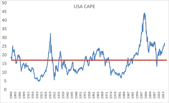
Source: Shiller
As you can see in the Figure 14, future returns are highly dependent on those starting valuations. The current reading as of December 2014 is 27, which is about 60% above the long-term average of around 16.5. At the current levels over 25, future median ten-year returns have been an uninspiring 3.5% nominal and 1.00% real since 1900. Not horrific and not quite yet in a bubble—but not that exciting either. Once CAPE ratios rise above 30, forecasted future median real returns are negative for the following ten years – it doesn’t make sense to overpay for stocks!
Figure 14 – Ten-Year CAPE Ratio vs. Future Returns, 1900-2014
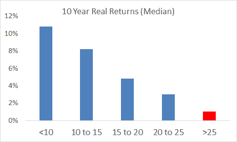
Source: Shiller
U.S. 10-year government bonds, on the other hand, have proven to be a wonderful place to invest during the past 15 years. The compound return was 6.24% and a nice 3.82% after inflation. The problem here, however, is that these wonderful recent returns come at the expense of future returns as yields have declined from around 6% in 2000 to near all-time low levels in the U.S., currently around 2%.
Future bond returns are fairly easy to forecast – each future bond return is simply the starting yield. Currently, your ten-year nominal return for buying U.S. government bonds will be around 2.25% if held to maturity.
So investors are presented with the following opportunity set of annual returns for the next ten years (assuming 2.25% inflation going forward, rounding to make it simple):
- S. Stocks: 3.50% nominal, ~1% real
- S. Bonds: 2.25% nominal, ~0% real
- Cash/T-bills: 0.00% nominal, -2% real
That leaves a 60/40 investor with a 2-3% nominal return no matter which way you slice it, or about a 0-1% real return. Not exactly breathtaking! Many investors expect 8% (or even 10% returns) per year when, in reality, expectations should be ratcheted down to more reasonable levels.
Other highly respected research shops forecast similar bleak returns for U.S. stocks and bonds. You can find more info at AQR, Bridgewater, Research Affiliates, and GMO.
So where should investors look for returns while minimizing their risk of overpaying? In the coming pages, we examine the benefits of expanding a traditional 60/40 allocation into a more global allocation with an additional focus on real assets as well.