Episode #29: Tom McClellan, The McClellan Market Report, “Now Everybody Knows What the Outcome Is, They Can Get Back to Focusing on Real Things That Actually Matter”

![]()
![]()
![]()
![]()
![]()
Guest: Tom McClellan is the editor of both The McClellan Market Report and The Daily Edition. He is widely sought as a lecturer, and his market timing signals have helped him be repeatedly ranked high by Timer Digest. For the 10-year period through 2006, Timer Digest rated him No. 1 for Gold Timing and No. 4 for Stock Market Timing. He was also Bond Timer of The Year for 2005.
Date Recorded: 11/9/16 | Run-Time: 41:17
Summary: In Episode 29, we welcome market veteran, Tom McClellan. Meb starts with some background on Tom – he’s been doing financial writing for 20 years, likely making him one of the longest-running financial writers in the business.
The guys then provide an overview of Tom’s proprietary market tool, the McClellan Oscillator. The roots of the Oscillator date back decades ago, when Tom’s father, Sherman, was trying to develop a system by which he could better time corn purchases for their farming business. (It turns out, you can get a better price in March.)
In short, Sherman eventually crossed paths with some technical analysts who were exploring breadth statistics in the market (advance/decline line). Sherman applied moving averages to the advance/decline line, and a few tweaks later, we got the McClellan Oscillator.
Meb then asks about the best way investors can use the Oscillator, and what the signals are telling us now. Tom gives us a quick tutorial, then suggests that the Oscillator is saying “oversold” (keep in mind this episode was recorded on 11/9). It has been correcting since July, but now that election is over, maybe we’ll see that change.
With the election in mind, Meb brings up the sentiment he’s heard from many investors: “I want to wait until the election is over and things are more certain.” Meb finds this amusing, as when are the markets ever certain?
This segues into Tom’s election indicator. It had predicted Trump. Tom gives us more details about the mindset behind his indicator. In essence, we see market movements reflected in the poll numbers. In other words, the market is a leading indicator for where the polls will go.
As evidence, he references the election when Bush/Gore was too close to call, discussing this through the prism of what the markets were doing at the time. And in this most recent election, the indicator had called for Trump to win though the polls didn’t. Tom says that’s because the poll numbers before the election hadn’t reflected the big decline in the stock market in the week leading up to the election – but that decline did show up as a change in the actual vote.
This sets the guys off on a conversation about “sentiment” which is an indicator Tom loves. Then Meb steers the conversation toward interest rates and the Federal Reserve. It turns out, the guys believe you can tell where the Fed should set the Fed Funds Rate by looking at what the yield is on the 2-year note. It’s when that doesn’t happen that we see market issues. Tom gives us an example from Bernanke’s tenure.
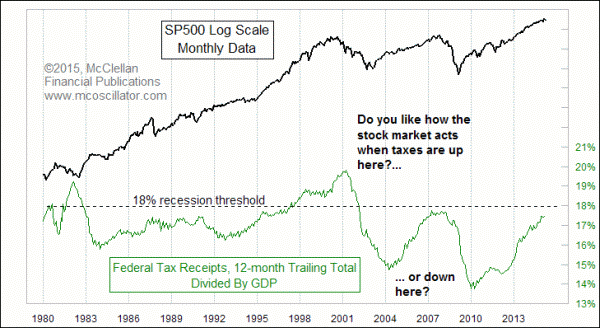
Meb then points toward another chart from Tom: the S&P verse Federal Tax receipts divided by GDP – in essence, how much the government is collecting in taxes. What’s the relationship here? Well, if you’re against the government taxing too much, you’ll likely agree with the findings.
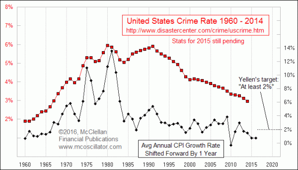
There’s more fascinating conversation about Tom’s various charts. For instance, the common conception is that a slowdown in the economy leads to an increase in crime. Tom says not true. Do you know what is correlated to an increase in crime? Inflation. What inflation does in Year 1 is what crime will do in Year 2.
Meb then asks about the biggest mistakes that investors make when creating their own charts. Tom tells us that people want to simplify too much. “Just give me the one chart that will work.” Unfortunately, there is no holy grail. If you’re looking for easy answers, the stock market is not the place to find it. Look for more obscure indicators. If everyone is using the same indicator, there’s no value there.
There’s lots more, including a conversation about “value.” Turns out, Tom doesn’t really use value at all. In fact, he says there are only two variables that matter. What are they? Find out in Episode 29.
Sponsor: One Blade
Comments or suggestions? Email us Feedback@TheMebFaberShow.com
Links from the Episode:
Charts from the Episode: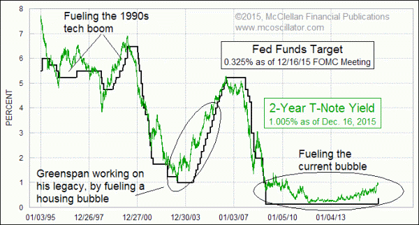
Transcript of Episode 29:
Welcome Message: Welcome to The Meb Faber Show, where the focus is on helping you grow and preserve your wealth. Join us as we discuss the craft of investing and uncover new and profitable ideas, all to help you grow wealthier and wiser. Better investing starts here.
Disclaimer: Meb Faber is the co-founder and chief investment officer at Cambria Investment Management. Due to industry regulations, he will not discuss any of Cambria’s funds on this podcast. All opinions expressed by podcast participants are solely their own opinions and do not reflect the opinion of Cambria Investment Management or its affiliates. For more information, visit cambriainvestments.com.
Sponsor: Today’s show is sponsored by the OneBlade, makers of the world’s finest shaving instrument. As you probably know, I often have a beard, and that’s rarely shaved, but when I do, I use a solid, stainless steel OneBlade razor. The shaver provides the closest thing you can get to a professional barbershop shave right in your own bathroom. And I’m not sure if you’ve seen it yet, but basically the guys at OneBlade took the best features of single and double-edged safety razors, along with the floating, pivoting head common and cartridge razors, to make the OneBlade razor truly stand apart as a luxurious, high-performance shaving tool. There’s just nothing else like it. So get your OneBlade today, and if you do, you’ll get a complete starter kit, including pre-shave, shaving cream, after-shave, and a shaving brush all for free. Just go to onebaldeshave.com/meb. That’s one, spelled O-N-E, bladeshave.com/meb.
Meb: Welcome, ladies and gentlemen, to the podcast. I would like to extend a warm welcome to my friend, Tom McClellan. Tom, welcome to the show.
Tom: Hi, Meb, nice to be with you.
Meb: It’s great to be here. Last time I think we hung out was having beer somewhere in the Seattle Waterfront. I apologize if my voice is a little scratchy today. Like many listeners, I imagine, I’m recording this the morning after the U.S. presidential election, so didn’t get a whole lot of sleep. Was certainly an interesting and existing time. But, Tom, so I thought we would start out by… Like many of our guests, you have a fairly atypical background. I know, like I started out… I think you started out studying aerospace engineering. So maybe just a quick overview of how you got started out in our world, in our business, and then we’ll move on a little bit to some investment ideas.
Tom: Sure thing. Well, I grew up in Los Angeles. I don’t like to live there now. I live up here in the Pacific Northwest, as we like to call it. I joke around and say, “Yeah, I left behind the brush fires, and the earthquakes, and the gang fights, and gridlock to move up here so I could live halfway between a nuclear submarine base and an active volcano.” And I grew up the child of Sherman and Marian McClellan, who together created the indicator known as the McClellan Oscillator. My mom passed away in 2003, but I still work with my dad every day. It’s a great privilege to have a dad like that and to get to work with him.
But along the way, though, when I was a young man and a teenager, I didn’t wanna do anything that my parents were interested in. So I got into motorcycles, and then I went off to West Point and flew army helicopters for 11 years. And only later as I got older did my parent get smarter and I finally got interested in what they were had been doing all along. I left the army in 1993 with the intention of starting a stock market newsletter, because I had gotten interested in the movement for the stock market. And we got that started in 1995, publishing an eight-page newsletter about the stock market, and bonds, and gold. Back then it was all printed and mailed, because there was no Internet to speak of. I kept asking around. People said, “You could publish on this Internet thing.” And I had to find out, “Well, what’s that about? And how do you do it?” And December 1997, we finally published our first issue in PDF format, and now it’s all Internet delivery, which is a wonderful thing.
Meb: That’s not a debut, but, man, the 20 years, you have to be one of the longer running newsletter writers. And that’s…you have two. You have the “McClellan Market Report,” which…is that biweekly? And then…
Tom: It’s twice a month, yeah. And then we also have a daily edition, comes out in the evening after every trading day. It’s a lot of work to write both of those in one day. There’s different perspectives that the people wanna have. Some people don’t want so much information, some people can’t get enough, and so we try to address that and look at the different time frames of the movements of stock prices, and bond prices, and gold in ways that are useful for how people decide they want to receive it.
Meb: It’s impressive. I struggled to get out a blog post or two per month, and the prospect of writing every day as well as getting two issues out, kudos to you. So you can also sign up for… And, too, I’ve been a subscriber for a long time. You can also sign up for a mailing list “Charts In Focus,” which you guys send out…is that once a month? Once a week? How often do you all send that out?
Tom: That’s once a week, and it’s just an opportunity to take a look at one chart on its own, or maybe with a companion chart, and get people familiar with the types of indicators that we use or something interesting. It’s whatever I feel like talking about that week. So that goes out to, I know, several thousand people every week, and you can also read it on our website. If you sign up for that on our website, we don’t annoy you with any spam or marketing. It really is a good deal. It’s just a way to try to get people more acquainted.
Meb: We’ll post the link on the show notes for the listeners. I highly recommend it, and there’s some really cool charts, some of which we’ll talk about today. And Tom definitely takes a very unique perspective on charting and looking at some of the most interesting and strangest indicators and time series out there. Why don’t we start? Our listeners would probably kill me if we didn’t get at least a very cursory overview of your, you know, namesake oscillator, kinda how that works, what’s going on with that, and then we’ll move into a little more the esoteric, some of the ideas as we go.
Tom: My parents created the McClellan Oscillator, and it wasn’t called that when they created it. They did that back in 1969. My dad had long been interested in the agricultural futures market, based on having a family farm back in Illinois that he was managing, and he got interested in charting, because the big decision of owning a farm is when do you sell the crop. They would grow corn every year, but if you try to sell corn in September and October when everybody else is going to market at harvest time, the prices will get depressed.
And what he found out by studying the charts is that prices go back up again around March, when all the hog farmers have exhausted their supply of cheap corn that they bought last autumn, and they need to buy some more. So if you store the corn and wait till the price rises in March, then you end up coming out better. So that was his introduction to charting. And he wanted to understand the stock market better. At that time in the 1960s, there was a TV station in Los Angeles called KWHY. It was a UHF station, little tiny thing. But it was really the first financial news station. It was…this is before CNBC, and before that, the predecessor FNN. It was just a little local market TV station that would talk about the stock market. And they invented things like the scrolling ticker at the bottom of the screen and showing live quotes of things.
And there was a guy that had a charting show every day, after the market close, a guy named Gene Morgan. He had a show called “Charting the Market.” He did the most amazing thing for people. He showed them that you could look at a chart and get useful information from it. Back in the ’60s, that was considered to be sacrilege, and the chartists were considered voodoo practitioners. But he showed them that you could do that and educated a lot of people in LA, and including my parents. That was sponsored by a newsletter called “Trade Levels,” or the “Trade Levels Report,” which was published by a guy named Pete Harlan.
And Pete Harlan was an interesting guy. He was an actual rocket scientist at JPL, who had access to one of the only computers west of the Mississippi. And so he would use the computer to do technical analysis, amazingly enough, and write a newsletter about it. He, Pete Harlan, and other people had gotten interested in looking at breadth statistics in the 1960s. That’s advances minus declines. Because, in 1962, both Richard Russell and Joe Granville had noted in their newsletters that the advance decline line had showed a bearish divergence versus the Dow ahead of a big 27% decline in 1962.
Well, suddenly people found out, “Hey, great, there’s an indicator that can tell us about that thing coming ahead of time.” And there was certainly a whole lot of interest in the advance decline statistics. The insight that my parents applied was that they looked at moving averages of the daily advance decline data, and they found out that, you know, those were interesting, but the key insight was they looked at the difference between two moving averages of the advanced decline data, and that’s what came to be known as the McClellan Oscillator.
And the really fascinating part of the story is, a bit of serendipity, 1969 was also when Gerald Appel invented MACD, which is basically looking at the difference between two moving averages of price or some other series. They did this on opposite sides of the country, no communication between them, just two different analysts coming up with the same pearl of wisdom that there is information about the market in the distance between the two moving averages.
Meb: It’s fascinating. We’re getting a bit of a graduate level course on technical analysis history as well. And so what’s the most traditional way that you have found to use the oscillator over the years? Is there any sort of go-to application, and what’s kind of your general thoughts there?
Tom: Sure, but there’s some basics to it, and the more you’ll use it the more you find little pearl of wisdom in what it has to tell you. It’s an oscillator, so it means it goes up and down across the neutral level, in this case the zero line. When it goes up really high, that shows an overbought condition. When it goes down really low, that shows an oversold condition.
Generally speaking, the market does better when the oscillator’s positive, does worse when it’s negative, but it can also show you divergences when you say, for example, lay lower, price low but a less negative reading on the McClellan oscillator. Interestingly enough, when you get a really, really low reading, deeply negative, that tends to market conclusion of a decline. But when you see a really, really strongly high positive reading, that doesn’t mean the conclusion of the advance, because up and down are really not the same in the stock market.
The highest positive McClellan Oscillator readings occur during the strong initiation phase of a new uptrend. If you see the McClellan Oscillator go up well above about plus 150, you’re just about guaranteed that you’re not at the high for that move, which is a nice piece of information to get. You might have a down day, but you’re still going to have an up day that’s gonna probably exceed that level.
Meb: Fair enough. Any sort of signals now, or is it kind of quiet?
Tom: It’s been getting down to an oversold condition, but because we’ve been correcting since July, as everybody has been just panicked, worried about what the election might mean, now we don’t have to worry about what it might mean. We just get to find out what it does mean. But we don’t have the… See, investors are funny. We get the most worry over unknown risks. Well, now the election is not an unknown risk. It’s now a known risk, and we don’t worry about those as much. We’re just training people that way.
Meb: Well, we definitely spend a lot of time pulling our hair out, talking to clients and investors the last few months. And, you know, one of the things we kept saying, there’s couple things, now that we’re kind of segueing on to election talk is, I can’t tell you how many times I heard people say, “I’m just going to wait until after the election, when things are more certain.”
And that’s such a strange statement to me, because when is the investment world ever certain, you know? So there’s always some sort of crazy geopolitical event going on. And so we had been writing a little bit about the election. We did a post on, you know, saying that the outcome didn’t really matter that much and what people were worried about was probably not what they should be worrying about. But we also wrote a couple of articles. There’s a famous one that the stock market indicator of the performance in the stock market leading up to the election can often, has had a very strong signal, you know, saying who would stay in power, or the party that would stay in power, or when they would come in. And then you’ve also written a lot about this. And I think it actually was predicting Trump as well. What was the particular sorta indicator or chart you were using to talk about the election?
Tom: Well, there’s a couple of parts to that. Generally speaking, if investors are in a bad mood, things are going bad, they’re gonna be selling in their stocks and pushing the stock market down. And they’re also gonna be not liking the performance of whoever is in office. Irrespective of whether that has any bearing on reality, people, if they’re in a bad mood, they blame the guys who’s in the White House. When you have a down year for the stock market, the party in power tends to not do well in the election. And it gets even a little bit more refinement, and I’ve been doing this analysis since the 2000 election, or if you look at the movements of the Dow Jones Industrial Average or whatever index you prefer, you find out that the same movements day to day appear in the poll numbers, and except that they appear with a lag time of about a week or two.
In other words, the stock market is gonna give you a leading indication for where the poll numbers are gonna go later on. I watched that the first time in the 2000 election, and people may not remember back that far, but in late October, then Governor Bush was up by as much as 13 points. In late October, he was still up by six points in the last poll before the election, but on the day of that last poll, I published in my newsletter a note saying the election was gonna to be too close to call in 2000. Even though Bush was up by six points, I said it was going to be too close to call, because what I had seen was the stock market had rallied that week before the election. And a market rally the week before the election tends to benefit the party that’s in power, which basically a race in Vice President Gore. So a deficit in the poll and brought him back to even. In fact, it was too close to call for six weeks afterwards.
This time in 2016, I published a “Chart In Focus” article with my final election forecast, the Thursday before the election, and saying that Trump ought to win the popular vote by about 3% to 4% points. He did end up winning the Electoral College vote, and the popular vote as I’m seeing it this morning is about even. So I was off in that respect but correct about the outcome of what the vote would be. And this happened as, you know, poll numbers were still showing up a large margin of victory of three to four points for Mrs. Clinton. But what the poll numbers hadn’t reflected yet was the big decline that we saw in the stock market the week leading up to be election.
And that decline reflected the change in the public’s mood, that week that showed up as a change in the actual vote versus what the poll numbers were saying. So it’s not a case where the poll numbers were wrong. They were probably accurately reflecting how people were feeling when the samples were done several days ahead of time. It’s just that people change their minds at the last minute. And the stock market told us about how that was going to transpire.
Meb: You know, it’s funny. I mean, I was fielding a lot of tweets from kind of panicky friends last night. And when the Dow was done to 4, 6, 700, and I tweeted out. I said, “You know, I think who wins the presidency, in my opinion, is meaningless to investment returns going forward.” You know, a lot of people had this mindset that if Trump got elected, and even Bridgewater, the largest hedge fund in the world, came out with a client note, said markets are going to go down 5%, 10% around the world.
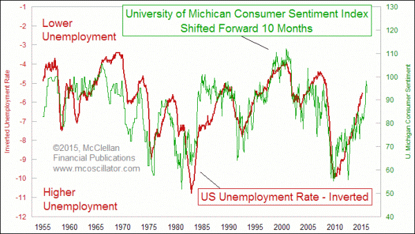
And it was such an ingrained common belief. Like, I don’t think I had talked to a single investor anywhere over the past three months that said, “If Trump get elected, the markets are going to go up, or it’s gonna be good or whatever.” Any time you have such a strongly held consensus, you know, I’m often of the opinion that that’s rarely right. And we talk a lot about this with sentiment. I know you guys do a lot of work with sentiment as well. I was kinda looking at some of the investor’s intelligence, bulls minus bears post, and you guys do a lot of these looking at sentiments. So how do you kind of think about sentiment in general? Is it something that you found to be highly useful, or not useful, or predictive, or what?
Tom: Sentiment Indicators are wonderful. They’re just a little bit harder to read. And you can’t just dive in and do an if-then equation based on any sentiment reading. It takes looking at several of them to try to get an insight about it. And just because people are already bearish, it doesn’t mean they can’t get a little bit more bearish or vice versa. The election result was a surprise for a lot of people. And so that’s why we saw the big selloff overnight. In the same way, last June, June 2016, we had the Brexit Vote. And with Great Britain leaving the EU and the outcome of that election or that, I guess, referendum by the British people, was a surprise to a lot of people. And so we saw a big two-day selloff in the stock market, and then a huge rebound as everybody realized, “Well, it wasn’t really the end of the world and what looked like a great buying opportunity.”
I think we have duplicated the Brexit vote reaction here in the U.S. stock market with the overnight selloff, and now we’re rebounding on the day after. It’s just that American markets are so much more productive and efficient. What took two days to resolve in Great Britain, we can get done with an overnight selloff and rebound. So we’ve already had that, and I think that now everybody knows what the outcome is, they can get back to focusing on real things that actually matter.
You know, the president of the United States doesn’t hold the levers of power over the economy that everybody thinks he does. We have this belief that, somehow if it’s a good economy, the president gets the credit, and if it’s a bad economy, the president is to blame. He doesn’t have any control over anything. The Fed has control over the monetary system and interest rates, which has a much bigger impact. The president doesn’t really have all that much he can do, but we think he does, and people act on that belief. And so that’s why you see all the fireworks are in response to the election. But now we can get back to focusing on real stuff.
Meb: All right. I think that’s incredibly insightful. You know, we talk a lot about interest rates. And I’m looking at one of my favorite charts of yours that compares fed funds target versus the two-year note yield. And, listeners, we’ll add some of these charts to the show notes, so you can take a look at them later. Maybe talk a little bit about that, because they track pretty closely, but there’s periods where the feds fund target is out of line with the T note yield. And you kind of mentioned that happened in particular in the late ’90s, as well as the mid-2000s, kinda creating some booms and bubbles, and it’s also kinda happening right now. What’s your thoughts there?
Tom: Yeah, it’s a great way to know when the Fed is screwing up. Just to define some of the terms for your listeners, the fed funds rate fluctuates every day. And it’s basically the outcome of an overnight auction of banking reserve that the Fed conducts. And the Fed is a participant in that auction, and adds reserves when it needs to, and subtracts reserves when it needs to, in order to hopefully get the outcome of that auction to match the target interest rate that is set by the FOMC, the Federal Reserve Open Market Committee. That’s what the big deal if, you know, Fed talks about keeping interest rates unchanged, or raising interest rates, or lowering interest rates. That’s them changing the target rate that the overnight auction manager is supposed to hit when he conducts that auction.
And you can tell where the Fed ought to set that rate by looking at the two-year treasury note yield. And if the Fed would ever just set their target rate equal to the, or very close to the two-year note yield, you’d have a much better market system. When they go too high, when they go above that yield, you have too restrictive of a condition. When they go below it, like we saw in early 2000s and like we’re seeing throughout the whole QE era, there’s too much stimulation, because interest rates are too low, are lower than what the market thinks that they ought to do. So we ought to just outsource the role of the FOMC and saying interest rates and just hire the two-year note yield and let the robot control it, and then it would be much more efficient.
We saw this really come into play after the 2007 market prop, the two-year note yield was dropping, and the Fed was holding fast under Bernanke, and they were too slow in reacting. And that contributed to the severity of that market decline and the severity of the illiquidity problem that hit the banking system and caused the collapse of Bear Stearns and Lehman Brothers. The Fed, to their credit, finally realized they had a problem and started lowering rates really fast, but it took them a long time to get their rate cutting all the way down to where the two-year note yield had already gone. If they would just watch what the market is telling them, they could do a much better job at that task and not cause us so much boom and bust.
Meb: You know, it’s really funny. You just reminded me of a memory I haven’t thought of in 15 years. When I was right out of college, I was living in San Francisco, and a body was working for one of the top economists at one of the investment banks in San Fran. Being a young, aspiring quant in market kinda history, starting to think about student, you know, I would go hang out with these guys. And being San Francisco, humorously, that would be over them going skateboarding, but it was actually like longboard skateboarding through Golden Gate Park or down near the beach. And so I remember asking him literally this question. I said, “You know, as someone who’s studied engineering and biology, I’m just curious. Why couldn’t the Fed just quantify this and peg this target rate to,” you know, and I just said short-term interest rates, “and be done with it? And that way, you wouldn’t have all this subjectivity.” And, of course, he went into some long eloquent explanation. But it seems, just from looking at the data, to be a pretty darn simple idea, but who knows, it’s an area that we probably wouldn’t have as much to talk about if they just had a simple formula for it.
Tom: Well, and you wouldn’t need an expensive PhD in Economics if the market could just do that job for you.
Meb: That’s right, that’s right. That’s funny. Look, this is super interesting. There’s another chart that I’m looking at that a lot of people, I think, when they think of investing, there’s a lot of axioms that they end up kinda getting 180 degrees backwards. And the one I’m looking at is a chart of the SMP versus federal tax receipts, and it’s trailing over the last year and so divided by GDP. So it’s basically how much is the government collecting in taxes, and maybe you want to talk about that chart in the conclusion. How does that play out with the stock market?
Tom: Well, it’s a pretty simple concept, that if the government taxes us too much, it’s taken too much money out of the economy and slowing down the economy, because there’s not a money left in it to go out and do things. If the government cuts taxes, that tends to be stimulative, because we have more money, and we get to keep it. And you can put some boundaries on that. We find that when the total federal tax receipts over the past year exceeds 18% of GDP, you get a recession every time. And it’s not often in the field of economics that you can use words like “every” and “always,” but it’s worked that way every time it’s been done, and we just hit 18% earlier this year. So no wonder we’re getting GDP numbers that are slowing down, aside from the inflated GDP numbers we just got thanks to the [inaudible 00:24:21] exports that saved the day.
Meb: That’s funny. Looking at this chart, and we’ll show it as if, you know, just ballparking back to the early ’80s, I mean, you had this period in the late ’90s when it was certainly over 18%, and it almost touched it kind of around 2006, 2007. And interesting to note that it’s hitting it again, and most people would assume that government budget surpluses and high tax receipts are a great thing, but really, you kind of mentioned it, it’s the opposite takeaway as an investor that it’s actually probably a warning sign more than anything.
Tom: Yeah, sure, and whenever I talk about this, people say, “Now, well, Tom, think about to when Clinton was in office in the late ’90s. We got all the way up to 20.7% of GDP and total taxes, and that didn’t cause any problem.” And my answer is, “Well, yeah, it did.” They killed the Internet bubble, that people don’t remember that the number of NASDAQ listed stocks peaked in December of 1996. We didn’t get the price peak all the way until March of 2000, but the destruction was already underway, because the government was hogging up too much of the money and capital, taking it out of the marketplace and out of the economy, and leading us to kill the great boom of the 1990s that had the technology boom, and we also had baby boomers at that time, were in their peak earning years and peak entrepreneurial years, creating lots of companies. Too much taxation stifled that, and the people who criticized me for that would say, “Whoa, we still balanced the budget and paid down the debt.” And that was a good thing, and actually, no, we didn’t. We didn’t pay down the debt at all, and we’d only balanced the budget using government accounting methods, which are flimsy and not widely known, but we increased the total federal debt every year in the 1990s. In fact, we’ve done it every year since 1957.
The total federal debt has gone up, so you can’t really say that you have a balanced budget or a budget surplus if you’re still having to borrow more to spend what you want to spend. And how we pay down $20 trillion worth of debt that we’ve piled up is a big problem. I’m really glad I’m not the one who has to solve that problem, but you can’t do it if you keep borrowing. And you also can’t do it if you try to do it with taking in more taxes and raising taxes, higher rates, because what that does is it just takes too much money out of the economy.
If any of your listeners are nuclear engineers, or you think of the control rods that you shove into the nuclear reaction chamber that absorbs some of the excess neutrons being given off by the nuclear reaction, and if you shove the control rods in too far, you’ll stifle the reaction and snuff it out. Same thing with high taxes. It’s like trying to go up a hill in too high of a gear, and you just don’t have the throttle capacity in the engine to power through that. You’ve gotta not take too big of a bite. You’ve gotta leave some money in the economy and not eat your seed corn so that you have money to do good things and keep the GDP growing and so that you have something to have taxes on. So the government hasn’t figured that out. I don’t have anybody in the Executive Branch on my subscription list as far as I know, so I’d be happy to sit down and tutor them about this, but the phone is not ringing.
Meb: Oh, good, hopefully they sign up. You know, then that’s the beauty and interesting part about our world, is that there’s so many of these competing forces and indicators, whether it’s valuation, or sentiment, or taxes in the government, and, you know they all don’t play out at the same time. There’s often very many coincident indicators. So the late ’90s, a lot of the indicators were lining up on the same side, but a lot of times you mention, certainly it’s not always that clear, you know. And so one of my favorite things about Tom’s publications and charts is that you’ll see charts and ideas for data series that, you know, you would not expect to see out a normal investment bank. So you’ll see charts I’ve seen on New York rainfall, on number of police deaths, on all sorts of stuff. And one of the ones that’s interesting, that I’ve spent little time thinking about, I’m not certain that I have a conclusion, is crime rates in the U.S., and it goes back to the ’60s versus inflation, and inflation forward of the year. But maybe comment very briefly on the relationship you’ve seen there and kinda what your general thoughts or takeaways are.
Tom: Well, there’s long been a hypothesis that, if you have a slowdown in the economy, that you’ll lead to more unemployment, and then people will turn to crime to put food on the table. And that is a hypothesis that has been around a long time. It’s unfortunately not one that survives contact with the actual data. When you when you look at GDP growth rates and look at the crime statistics which the FBI has been compiling and publishing since 1960, they just don’t correlate. And I wanted to find the answer to this because I’d heard that, and I wondered if it was really true. When I downloaded the crime statistics, which are available online, I recognized the plot. It was one that I’d seen before, because it was exactly the shape of the inflation rate over time, which I was very familiar with having studied that. And so I put those two on the chart, and it looked like each other, but it didn’t quite fit right. And so I played around with it a little bit and found out that I got a much better correlation when I shifted the inflation rate data forward by a year. So, in other words, whatever inflation does, that’s what crime rates gonna do going up or going down a year later, which is fascinating.
Meb: It’s interesting, because I’ve read some philosophical papers on this, and I’m not totally sold one way or the other. But one of the ones that was proposed was something along the lines of, look, when inflation is high, the future is much less certain. So you’re thinking about discounting cash flows, not specifically. But if you think of somewhere like Venezuela right now, what do you think about? You’re thinking about, as your money is getting inflated away very quickly, you’re thinking about tomorrow, you’re thinking about today, where are you’re going to get food? How are you gonna spend your money? The future is very uncertain. And so are you thinking about long-term planning and long-term consequences? Are you much more apt to live in the moment? And the opposite, of course, is something like the U.S. now, where we have very low interest rates, and because the interest rates and inflation is tame, you know, our people are a little more longer-term-focused. And does that play out in crime? And I think that’s a fascinating, philosophical concept. I don’t have a strong belief one way or the other, but it’s something that I kinda tap my head and say, you know, things that make you go, “Mmhh,” and think about…
Tom: Well, and maybe it’s not just robbery crimes. That would be what an economist would say that they’ll cause an effect, “Well, if the government’s stealing the value of my money, I’m gonna go out and steal something to make up for it.” It doesn’t just show up in the robbery crime statistics. It also shows up in violent crimes, in murders, and it shows up across the country, so it’s a durable effect that I think, if you really wanted to go find an explanation, you’d have to make note of the fact that most crime is done by young people. You don’t see too many 80-year-old murderers walking around or a guy who’s 80 breaking into your house and stealing your TV set. It’s young people.
And so if you have a fat demographic curve in the young age groups where most of that crime is occurring, you’ll get more crime. Possibly there’s a link to inflation based on having a lumpy demographic age group. That may be the place to go looking for it. But regardless of whether we can find a satisfying answer, when you’ve got 56 years of data, and it shows a great correlation, at some point you have to accept it.
Meb: That’s interesting. I’m gonna have to revisit that when I have a little more coffee and calories in me. Let’s take a step back. I’m gonna ask you just kinda two broad questions, and then we’ll start to wind down. I don’t want to keep you for too long. But this is been super, super interesting. So as someone who spends a lot of time with charts and building these, and, listeners, one of the coolest thing Tom does that he just mentioned in this last discussion is kind of this time shifting, where you’ll look at charts and maybe there’s actually not immediately obvious relationship, but it turns out that one series may lead one or may lag the other, and so Tom does a very good job of this. So, Tom, someone who’s been doing this for 20 years, what do you see is the biggest mistakes that investors employ when they’re creating a lot of these charts or trying to use them in their investment methodology and/or any just quick suggestions or notes for ways to think about it correctly for someone who’s been doing it so long?
Tom: There’s a tendency that’s strong and a lot of people they want to simplify. They don’t want to look at a whole bunch of indicators. They just say, “Just give me the one indicator that’s the really great one, and I’ll just look at that and forget all the other things.” There is no Holy Grail. If you only had a crescent wrench in your toolbox, a crescent wrench is a great tool, but you wouldn’t want to frame a house with it, because it’s lousy as a hammer. So you need to have several tools in your toolbox. If you’re looking for easy answers, the stock market’s not the place to find it, because if it were easy, so many would snatch it up and take away the opportunity. You have to look at a lot of stuff, and you have to put in the time. Don’t think that when you go to a charting website that just the default indicators that pop up with your chart are going to be the ones that give you answers, because everybody is looking at those. And so the answers disappear when everybody looks at them and focuses on them. But for the more obscure things, they’re going to give you the insights that nobody else is going to find.
Meb: Yeah, you know, it’s interesting where… We spend a lot of time with various quote models and indicators, and even when you have a simple indicators that work. So something as simple as value that we’ve been using and have…this goes back over 100 years, back to the days of Ben Grimm. Even people that understand it still end up making the same mistakes over and over again and applying kind of the wrong way. And so it’s tough. You know, it’s hard to resist the urge to try to find the one magic indicator, and it’s also hard for people to keep competing conclusions in their brain at the same time. You know, it’s hard for people to see say, for example, using value indicators as well as using something like a pure trend indicator. And by the way, is values something you guys look at at all, or is that something that you don’t spend too much time with?
Tom: No, I don’t spend very much time with that at all, because it’s not really that important, it’s not a fundamental driver for the overall stock market. If you’re looking at an individual company, then, yeah, what the value is of that company matters, but we’re focused on the overall market. And for that there’s really only two fundamentals that matter. The first is, how much money is there? And second is, how much does that money want to be invested? Which goes to the sentiment discussion that we had. So if you change either of those, then you move the market, and we saw some changes in how much that money wanted to be invested just recently with getting over the whole hoopla of this presidential election, but the amount of money is still there, and it’s waiting to go to work.
Meb: It always reminds me of the commenters talking about more buyers than sellers.
Tom: Yeah.
Meb: And funny part about that is, definitionally, there’s exactly always the same amount of buyers and sellers. It’s just whether, you know, who’s more aggressive, so who wants to be more aggressive.
Tom: Well, there can be more buyers than sellers or the other way around at a certain price.
Meb: Correct.
Tom: And if that happens, that imbalance causes the price to move to where those two things are equalized.
Meb: Absolutely. So we’re going to start to wind down. You know, one of the things we talk about at the end… And by the way, if there’s anything else you want to talk about before we get to it, just interject. But we often talk about things that our podcast guests find useful, or beautiful, or magical, something that most people don’t know about. You’ve got anything for us today?
Tom: Oh, I do, if you want to be a chartist, the first thing you should do is get a book called “Technical Analysis of Stock Trends” by Edwards and Magee, which is considered to really be the bible of basic bar charting. But there’s another book that if you want to be a really good chartist that people should look at, and they probably never heard of, it’s by a guy named Edward Tufte, T-U-F-T-E, and it’s called the Visual Display of Quantitative Information, and he talks about how you make an elegant chart and how you can display information in a useful way. But the one big pearl of wisdom out of that book is what he likes to call the data-to-ink ratio that you have in your chart. And that’s basically referring to, if you’ve got your chart quoted up with lines, and information, and doodads, and text boxes, and other stuff that’s not the data, then you’re contaminating the chart and stealing the message. So you want to strip away everything that you can that’s not essential, that’s not data, and think about optimizing your data-to-ink ratio. And when you can do that and get rid of the junk and see what the data actually is showing without covering up with a bunch of lines and things, then you can get better insights. So that’s the one pearl of wisdom that I would leave with your listeners.
Meb: I have that book on my shelf, and I’ll also post it to the show notes, and it’s one of my all-time pet peeves. You do such a good job of it, where if you look at charts, you should be able to have the initial takeaway almost immediately, it should be somewhat obvious. And I go to so many of these conferences, and these guys all throw up these charts, and you can’t understand what’s going on, and the fonts are size five, and then it’s just so bad. So I think that’s actually a great suggestion. Well, look, Tom…
Tom: John Bollinger had a note about that. The John Bollinger, the famous analyst who created Bollinger Bands, he said, “No matter where you travel in the universe, you will never be far from a Fibonacci expansion level or a gain line.”
Meb: That’s great. I’m going to remind him on that. We’re going to get him on the podcast. He’s a local Los Angeles guy, but he spends half the time all over the world, so we’ll get him on eventually. Look, so podcast listeners who wanna find more research about you or your writing, where can they find more info?
Tom: Come to our website, and it’s MC Oscillator, because we make oscillators, so it’s a contraction of the McClellan Oscillator, or just Google “Tom McClellan,” you’ll find me. There’s a free learning center on our website with a whole bunch of articles and insights about how we do our business. We also have subscription publications which have the good stuff. Come around and take a look.
Meb: Awesome. And you’re also on Twitter, too. What’s your Twitter handle?
Tom: McClellanOsc, O-S-C, where we reserved that years ago just to lock it up, and my webmaster, who’s more of a tech guy than I am, finally kicked me in the butt this past January and said, “You know, you really ought to get on Twitter.” So I started tweeting in January, and I’m up to 7,400 followers now, so we’re doing well there.
Meb: Okay. Well, good, we’ll put a link to it, too. Tom, listen, thanks so much for taking the time today. This has been awesome. Certainly, if you find yourself back down in LA, certainly come look us up, and we will do the same in Seattle. Listeners, thanks for taking the time to listen. We always welcome feedback and questions through the mailbag at feedback@themebfabershow.com. As a reminder, you can always find the show notes in other episodes at mebfaber.com/podcast. You can subscribe the show on iTunes, and if you’re enjoying the podcasts, please leave a review. Thanks for listening, friends, and good investing.
Sponsor: Today’s show was sponsored by OneBlade, makers of the world’s finest shaving instrument. As you probably know, I often have a beard, and that’s rarely shaved, but when I do, I use a solid, stainless steel OneBlade razor. The shaver provides the closest thing you can get to a professional barbershop shave right in your own bathroom. And I’m not sure if you’ve seen it yet, but basically the guys at OneBlade took the best features of single and double-edged safety razors along with a floating, pivoting head common in cartridge razors to make the OneBlade razor truly stand apart as a luxurious, high-performance shaving tool. There’s just nothing else like it. So get your OneBlade today, and if you do, you’ll get a complete starter kit, including pre-shave, shaving cream, aftershave, and a shaving brush all for free. Just go to onebladeshave.com/meb. That’s one, spelled O-N-E, bladeshave.com/meb.