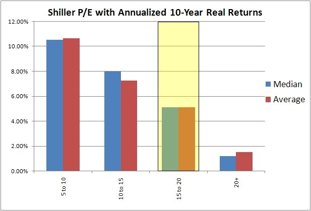
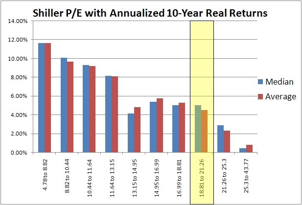
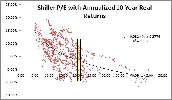
I was playing around with the data over on Shiller’s website the other day and thought I would post a few of the charts. Nothing mind-blowing here, it just annoyed me how you always saw the results posted in 5 pt buckets (which are arbitrary) rather than in quartiles or deciles. Below are the buckets, followed by the deciled, followed by a scatterplot. It seems like there are three groupings, great returns up to about 13, then decent returns up to about 20, then crappy returns over 20.


