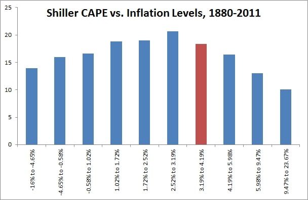
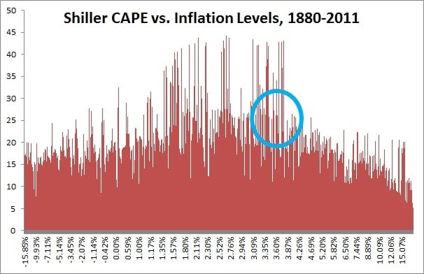
As a follow up to my Shiller PE post from a couple weeks ago, here are some charts that simply look at the Shiller CAPE vs. 12 month trailing inflation. As you can see, inflation of around 1% to 4% is rewarded with the highest multiples, but once you stay outside those bands watch out for some serious multiple contraction.
Charts inspired by the great book The Era of Uncertainty by Francois Trahan. All data from the Shiller Dataset.
More reading here:


