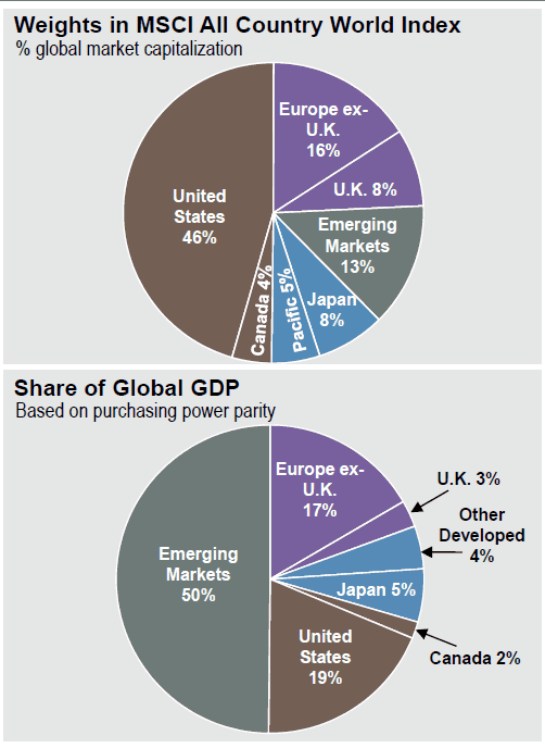
Below is a chart from the great JPMorgan Guide to the Markets from our last blog post. It details the US as a % of market cap (46%) and GDP (19%).
Now, how much of your stocks are in the US domestic market? My guess is more than 50%. Once you account for the fact the US is one of the more expensive markets around the globe, it might be a good time to rethink your stock allocation…
Are you sure you don’t suffer from home country bias?


