This is an older post but I had a reader asking about a similar topic so I thought I would repost…
Here are some long term charts based on the data from Morningstar / Dimson Marsh Staunton.
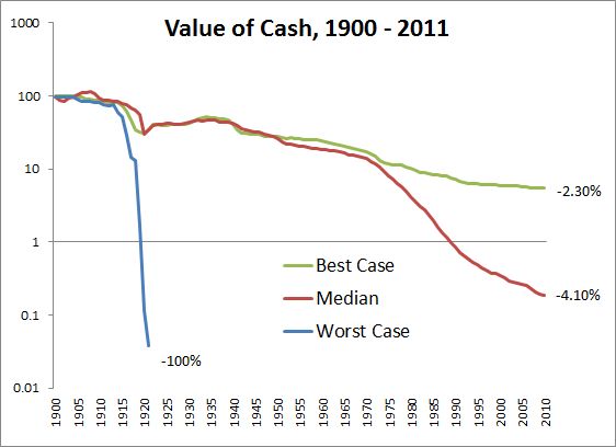
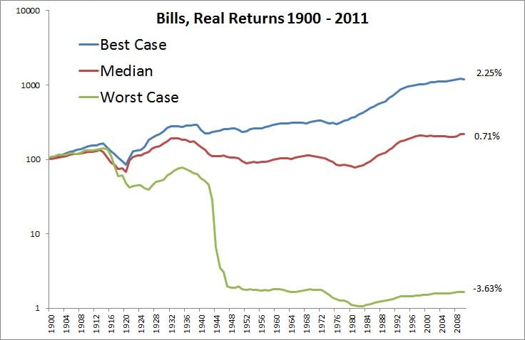
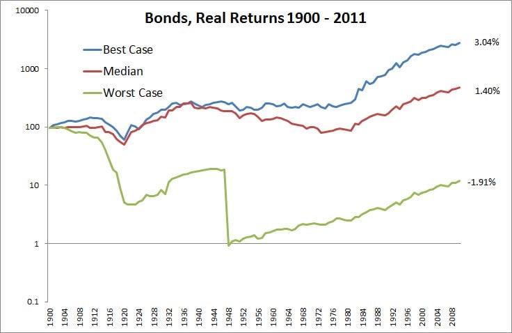
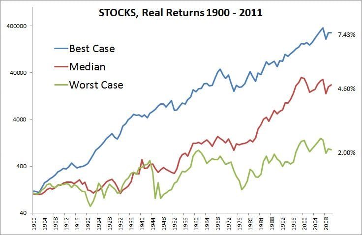
Below are the best, middle, and worst case scenarios for the main asset classes of sixteen countries from 1900-2011. All are real return series on a log graph (except the last one).
First, here are the best cases for returns on your cash. This chart goes to show that leaving cash under your mattress is a slow bleed for a portfolio. I excluded Germany after the first series as it dominates the worst case scenarios (in this case hyperinflation).
Best Case: -2.30% per year
Middle: -4.10%
Worst Case: -100%
Next up is real returns for short term bills.
Best Case: 2.25% per year
Middle: 0.71%
Worst Case: -3.63%
(Real Worst Case, Germany -100%)
Followed by the real returns for longer dated bonds.
Best Case: 3.04% per year
Middle: 1.40%
Worst Case: -1.91%
(Real Worst Case, Germany -100%)
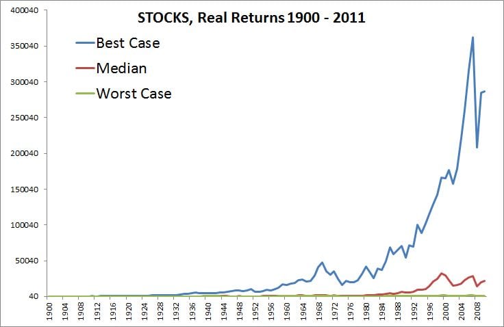
And finally, the real returns for equities.
Best Case: 7.43% per year
Middle: 4.60%
Worst Case: 2.00%
(Real Worst Case, China, Russia -100%)
And the same chart presented non-log…

