Lots of people commenting on a recent article from the very good blog Philosophical Economics written by @Jesse_Livermore. I’m writing a book on the topic of global stock valuation models probably out in January (and having a design contest for the cover here now).
An investor needs to be aware of the benefits, as well as the drawbacks of using any investment model. Too many people follow their models and opinions with religious like zeal, much to the detriment of their portfolios. Below we examine a few of the criticisms commonly heard when discussing the CAPE ratio.
Measurement period is too long. Critics claim recessions and expansions have an outsized impact long after they have faded from memory. “Estimating Future Stock Market Returns” by Adam Butler and Mike Philbrick tackles the issue of different measurement periods from one year up to thirty (as well as other valuation models). We take up this topic in an old blog post here and show the ideal period centers around seven years (thanks Ben Graham!). But realize that 1 year PE ratio works pretty well too. Note that CAPD works too!
It is impossible to compare across decades due to changes in accounting. One of the things that makes me really queasy as a portfolio manager is when people make “adjustments” to historical price data. The classic example is excluding 1987 from the analysis as an outlier. Why would you exclude something that actually happened? However, much like in our Shareholder Yield book, it is important to understand when there is a structural change in a market, and when is this time really different?
Critics complain about write downs and how that biases CAPE. However, critics also claim adjustments to CPI and accounting rules render comparisons across decades, or even centuries meaningless at worst, and at best inaccurate.
I’m not an accountant, but we will examine some ways to think about the above criticisms and see if they impact the measure, and if so, by how much. I really like Liz Ann Sonders at Schwab – she has a good piece on all things PE and makes a few comments:
“More recently, the move toward fair-value accounting standards resulted in security losses having a devastating effect on the reported earnings of financial institutions during the recent financial crisis. Yet that effect now appears to have been transitory. If an accounting item is deemed non-recurring, it’s common practice to ignore it when determining underlying earnings (i.e., using “operating” instead of reported earnings). But CAPE continues to reflect the effect of non-recurring items for the 10 years that follow their initial recognition in reported earnings.”
The blog Philosophical Economics examines how reported earnings in the US have been inconsistent over time. Shiller uses Generally Accepted Accounting Principles (GAAP) earnings from S&P, also known as reported earnings. However, the early 2000s witnessed the introductions of FAS 142/144 which altered how companies amortize goodwill. I will not bore you with a long overview, but this has the potential effect of biasing earnings down, and CAPE up. Another CAPE critic, Jeremy Siegel, penned this note in the FT back in August 2013 in “Don’t put faith in CAPE crusaders”:
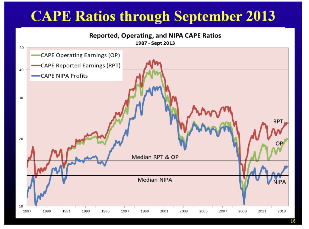
“I believe the Cape ratio’s overly pessimistic predictions are based on biased earnings data. Changes in the accounting standards in the 1990s forced companies to charge large write-offs when assets they hold fall in price, but when assets rise in price they do not boost earnings unless the asset is sold. This change in earnings patterns is evident when comparing the cyclical behaviour of Standard and Poor’s earnings series with the after-tax profit series published in the National Income and Product Accounts (NIPA).”
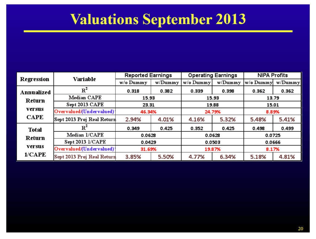
Siegel has a white paper “The Shiller CAPE ratio: A New Look” and powerpoint presentation here. (I added his charts at the end, but note all measures show some overvalucation currently.)
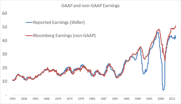
I used the series from Bloomberg mentioned in the Philosophical Economics article, and you can see the difference in the below Figure, and note the similar tracking until the early 2000s.
FIGURE : EARNINGS COMPARISONS, 1954-2012
Source: GFD, Bloomberg, Philosophical Economics
Which series is “correct”? Well, they both are, but perhaps the red line is more consistent across time. I honestly don’t know, but a better question is, does it even matter?
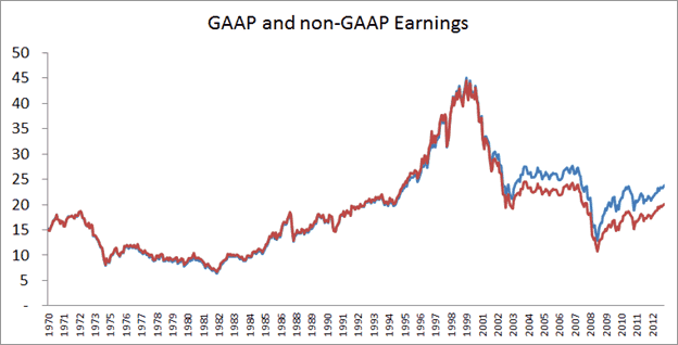
Below is a Figure of both CAPEs, adjusted and non-adjusted. While the CAPE declines from ~25 for the reported earnings series to ~21 for the non-GAAP series, both reach the same conclusion generally and currently, albeit with different magnitude . US stocks are not cheap. While we agree there may be some variation, in our paper we examine the CAPE in over 30 foreign markets with supporting results.
FIGURE : CAPE COMPARISONS, 1970-2012
Source: GFD, Bloomberg, Philosophical Economics
A similar take on the topic is from Societe Generale who put out an excellent piece titled “To Ignore CAPE is to Deny Mean Reversion”. They use the MSCI earnings index that doesn’t include the writedowns and they come to the same conclusions as using the S&P series – some overvaluation.
Recessions bias CAPE up. Bubbles bias CAPE down. People often find a way to justify their market stance. I’ve humorously received both of these critcisms from market bulls and bears! Here is a sample from one of my friends “We don’t like using the CAPE because it includes 2008-2009 earnings which distorts the PE since earnings are too low.” My response to this is, well, according to your logic, do you also exclude 1999 and 2007 as being abnormally high? And then, if you make the adjustments, does it even matter? This is a similar, but slightly different argument (one off recessions) than the prior one (an accounting inconsistency).
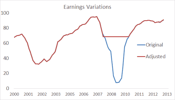
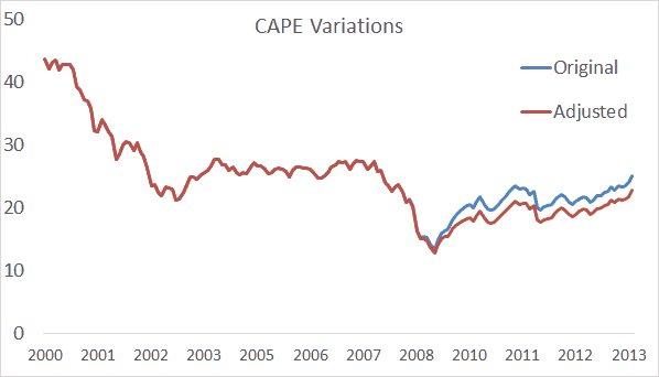
Below we adjust the earnings series from Shiller to pretend like 2008/2009 never really happened. We adjusted the earnings series so that earnings didn’t decline in 2008 and 2009 (they had already started to decline a bit in 2007). The second chart is the adjusted CAPE series. If you adjust the data it moves the CAPE from approximately 25 to 23. There is basically no difference and stocks are still expensive, but not terribly so due to the mild inflation sweet spot we are in.
FIGURE : ORIGINAL AND ADJUSTED EARNINGS, 2000-2013
FIGURE 12: ORIGINAL AND ADJUSTED CAPE, 2000-2013
Source: Shiller, GFD.
CAPE isn’t really a short term timing measure for one market. Like most valuation measures, it is a blunt tool and it’s not that helpful telling you what to do for the next few months. It makes much more sense to align the indicator with the measurement period. However, pretty much every value measure we track aligns to say the same thing – US stocks are expensive.
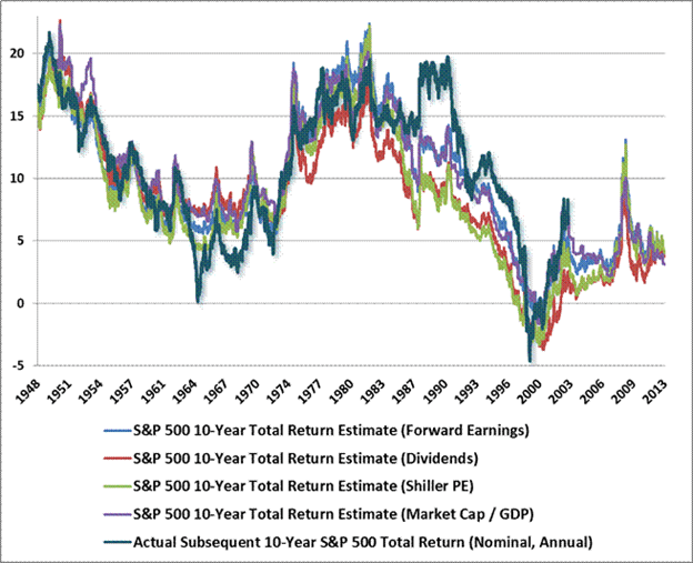
As Dr. Hussman shows in his weekly commentary and in his chart below, it doesn’t really matter which market valuation metric you prefer, most signal a bit of overvaluation to the market. It’s nothing nearly as awful as the late 1990s, but it means that until this valuation “burns off”, which can take years, decades, or possibly even a month or two if we had a crash, we will have somewhat muted returns of perhaps 2-5% nominal per year. Below are his charts that examine some basic valuation metrics. (We also examined this in our paper on the FF data with totally different metrics and dataset with similar conclusions, value works!)
FIGURE : VALUATION METRICS 1940 – 2012.
Even Mr Bogle uses a different metric – P/B on the Dow (from BI).
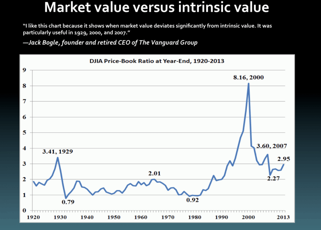
CAPE and other valuation methods are interesting on a stand-alone basis – but in this global age why focus on only one country? Much more important is expanding the opportunity set to include all of the countries in the world and buying the cheapest instead of the owning the most expensive and often biggest by market cap.
Siegel’s Charts:

