One of the things that makes me really queasy as a portfolio manager is when people make “adjustments” to historical price data. The classic example is excluding 1987 from the analysis as an outlier. Why would you exclude something that actually happened?
My friend John Bollinger often says (paraphrase), “all of the interesting information is in the tails”. A friend emailed me this morning asking about our CAPE research. First of all, let me state there is nothing magical about smoothing earnings across 10 years. In fact, using 1 year earnings (or Price/Book, P/cash flow, or P/sales all work, please see the appendix in our Global Value paper). Most of the value indicators usually line up on the same side, and I think an ensemble method is a great idea.
I really like Liz Ann Sonders at Schwab – she has a good piece on all things PE and makes a few comments:
“More recently, the move toward fair-value accounting standards resulted in security losses having a devastating effect on the reported earnings of financial institutions during the recent financial crisis. Yet that effect now appears to have been transitory. If an accounting item is deemed non-recurring, it’s common practice to ignore it when determining underlying earnings (i.e., using “operating” instead of reported earnings). But CAPE continues to reflect the effect of non-recurring items for the 10 years that follow their initial recognition in reported earnings.”
Anyways, the question from my friends was “We don’t like using the CAPE because it includes 2008-2009 earnings which distorts the PE since they are too low.” My response to this is, well, according to your logic, do you also exclude 1999 and 2007 as being abnormally high? And then, if you make the adjustments, does it even matter?
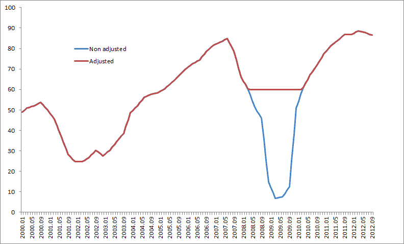
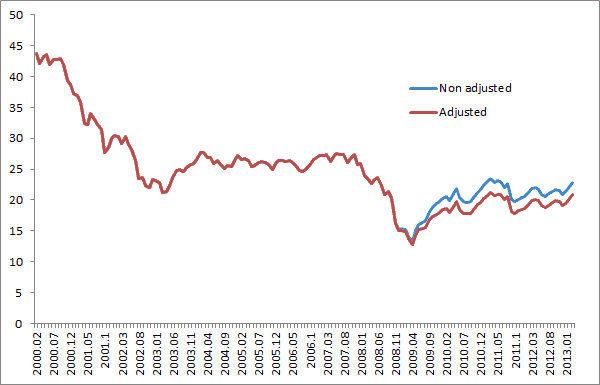
Below we adjust the earnings series from Shiller to pretend like 2008/2009 never really happened. We adjusted the earnings series so that it only declined a little bit as seen in the first chart below to reflect a normal recession. The second chart is the adjusted CAPE series. If you adjust the data it moves the CAPE from 22.9 to 20.9 (this was a month or so ago when I wrote this). ie basically no difference and stocks are still slightly expensive, but not terribly so due to the mild inflation sweet spot we are in.
CAPE and other valuation methods are mildly interesting to me on a stand alone basis – but MUCH more important to me, is expanding the opportunity set to include all of the countries in the world and consistently buying the cheapest instead of the owning the most expensive and often biggest by market cap.
You can download our JOI version of the CAPE paper here with much prettier graphs than the first version (and a ever so slightly different dataset, albeit with same takeaways and conclusions).
First chart is E, second chart is CAPE.


