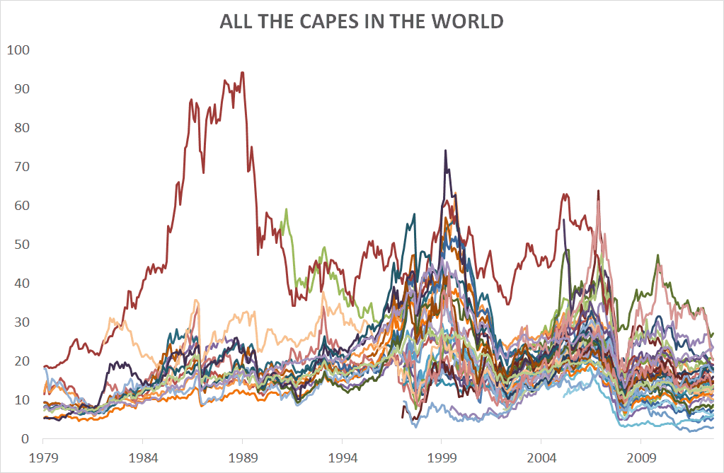
• Home
  • About
  • Books
  • Timing Model
  • Managed Assets
  • White Papers
  • Speaking
  • Podcast
    • Podcast
    • Podcast Categories
  • Meb’s Deals
  • Contact
Search
Meb Faber Research – Stock Market and Investing Blog
  • Home
  • About
  • Books
  • Timing Model
  • Managed Assets
  • White Papers
  • Speaking
  • Podcast
    • Podcast
    • Podcast Categories
  • Meb’s Deals
  • Contact

World CAPEs

August 20, 2013
Facebook
Twitter
Google+
WhatsApp
Linkedin
Email
Print

    I thought it would be interesting to visualize all of the countries and their 10 year PE ratios in one chart.  

    Enjoy!


    Clipboard01

    Facebook
    Twitter
    Google+
    WhatsApp
    Linkedin
    Email
    Print
      Previous articleRukeyser Reborn
      Next articleDividend Yield Strategies in a Rising Rate Environment
      Meb Faber

      RELATED ARTICLESMORE FROM AUTHOR

      Episode #483: Burton Malkiel – Applying ‘A Random Walk’ to the World Today

      Episode #479: Jim Chanos & Bethany McLean on Regulators, Enron, Earnings Adjustments, & The Golden Age of Fraud

      What If You Owned No US Stocks?

      MEB FABER is co-founder and the Chief Investment Officer of Cambria Investment Management, and author of multiple books.

      Subscribe to the Podcast
      Subscribe to YouTube

      Join our mailing list

      SYLD
      The Idea Farm

      Archives

      • Privacy Policy
      • Terms of Use
      © 2006- Meb Faber Research – Stock Market and Investing Blog