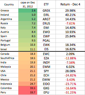
I’ve been publishing CAPE updates for countries quarterly on The Idea Farm, and below I highlight a blurb from our upcoming year end outlook. This chart shows the returns to country ETFs and the 10 cheapest and 10 most expensive markets. Notice why I was so unpopular in Bogota in January when I said they have one of the most expensive markets in the world! Also notice the big outlier in the expensive country bucket (the US). Due to all of the expensive countries declining and the US appreciating, we are now the most expensive in the world.
Also note the explosive returns in the cheap countries. (Portugal only recently had an ETF launch).
As Rasheed Wallace would say, the ball don’t lie!


