A few weeks ago, I was sipping coffee, thumbing through Barron’s as I do every weekend. It’s a way in which I keep a pulse on what’s going on in our space.
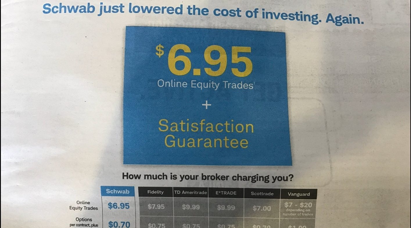
Though I never consciously pay attention to ads, on that particular morning, one caught my eye – a big full pager from Schwab, below. They were trumpeting their low-cost trading commissions in the ongoing fee compression in the investment management space. (Since this ad, Schwab and others have since continued to lower costs, with Schwab now down to $4.95!)
For anyone having trouble seeing the ad, it favorably compares Schwab’s pricing to competitors Fidelity, TD, E-Trade, Scottrade, and Vanguard.
Click to enlarge.
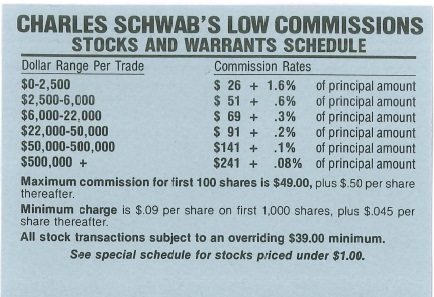
First, that is great news for all investors. And it’s certainly huge progress from what brokers used to charge…look at this old Schwab commission schedule below…$26 PLUS a 1.6% principal fee. And they were bragging that those were LOW commissions. Sheesh, I would hate to see high ones…
Click to enlarge.
Anyways, that’s not the point of my article. A few pages later, there was another ad, this time from Interactive Brokers:
Click to enlarge.
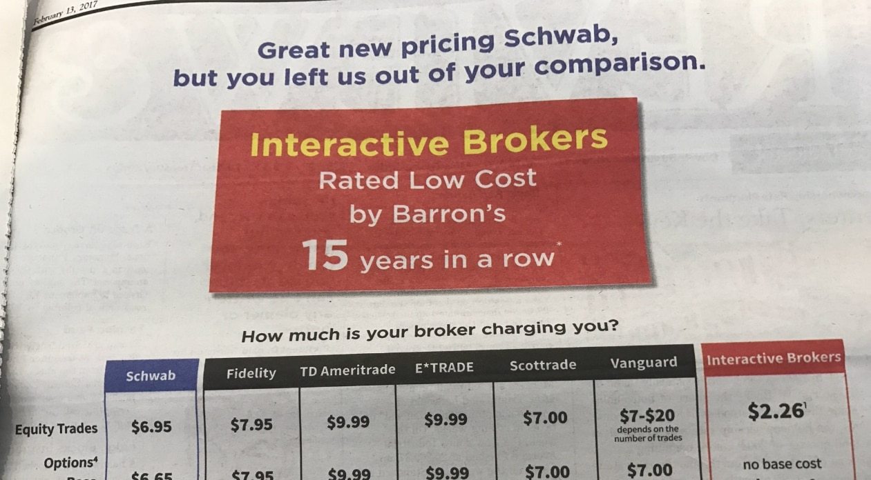
In case you’re having trouble seeing the details, this Interactive Brokers ad largely mimics the formatting of the Schwab ad – except it includes its own pricing in the chart which Schwab had featured so proudly just pages before. Unfortunately for Schwab, Interactive Brokers’ pricing is easily the lowest of all.
That’s some pretty impressive trolling by IB! I chuckled quite a bit at this ad, and honestly, was surprised Barron’s let it run. Though, to be fair, I haven’t seen it since so I’m guessing the ad (and maybe the account rep) got the axe after this issue.
But it brings up a good point: a comparison is only as good as the universe you decide to include. Schwab only looks like the best because they conveniently decided to omit the brokerages that charge lower fees. Now, to be fair, IB did the exact same thing. In its comparison, it omitted Robinhood, who charges $0/trade…
But this article isn’t about fees. It’s about comparisons, and the damage that misleading comparisons can do to investors and their core investing beliefs.
So let’s now apply this point to a common investing belief involving dividend growth stocks that’s likely far more present on your radar…
I can’t tell you how many times I’ve seen the following graphic, as I’m sure you have too (if not, just do an image search for “dividend growth” on Google):
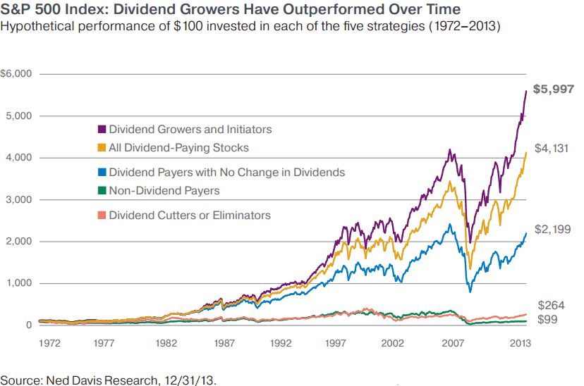
The take away is simple – invest in dividend growth stocks!
Usually this piece is tied to marketing for a dividend ETF (over 100 now) or a dividend mutual fund (God knows how many of those there are).
So what’s wrong with this picture? After all, dividends have a great brand and tell a great story…
The problem is that it’s incomplete.
Frankly, it’s “Schwab vs Interactive Brokers vs Robinhood” just in different clothing.
I partnered up with our good friends at Alpha Architect, and had Jack Vogel run some simulations on dividend stocks for us. Here’s what we found dating back to 1982 (results are similar to 1972):
Click to enlarge.
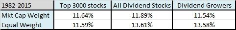
Source: Alpha Architect
Hmmm, sort of at odds with the above chart. Where’s all that towering outperformance of dividend growers?
It turns out that Ned Davis (whom we love more than any quant shop on the planet) had been calculating the returns in a different way than what we’re currently used to. The Ned Davis statistics are based on geometrically weighted indices. When they created them over 15 years ago, geometric indices were common. However, the industry has since shifted to arithmetic indices. One of the reasons is that geometric means suppress the performance of outliers. Two years, ago Ned Davis introduced arithmetic weighted dividend charts.
Now, with its updated return calculations, Ned Davis shows dividend growers returning 12.89%, all dividend stocks 12.83%, and equal weight S&P 500 12.35%! (All beginning in 1973.)
So, an entire generation of funds was sold on the premise of dividend growth outperformance. The problem is it’s misleading because it doesn’t tell the whole story.
If you did a simple sort on high dividend yielders (top quintile), you would find they outperform dividend growth. Sort of like the Schwab/IB example…
Click to enlarge.
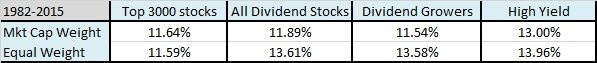
Source: Alpha Architect
Not sure you believe me? Okay, here’s a great piece done by O’Shaughnessy that adds detail to the same conclusion: dividend investors would do better by focusing on dividend yield rather than dividend growth.
Ok, so simple high yield beats the growers. But I think you all know where I’m going with this…sort of like the late night, “but wait, there’s more!” infomercials.
You all likely know by now how nonsensical I believe dividend investing to be. I think it’s one of the most basic mistakes retail and pro investors make alike. But as I’ve written a book on the topic, as well as countless blog posts, I won’t repeat my reasons here; instead, a few links for anyone interested:
What You Don’t Want To Hear About Dividend Stocks
How Much Are Those Dividends Costing You?
But let’s return to our theme of “what’s missing from the comparison?”
In Schwab’s ad, it conveniently ignored IB. In IB’s ad, it conveniently ignored Robinhood. What are the various marketing pieces of all these dividend funds ignoring?
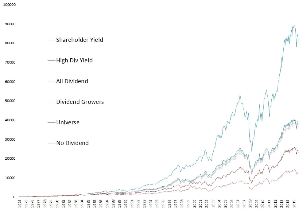
They’re all ignoring how companies distribute over HALF of their cash flows to investors – through buybacks. Once you take a more holistic view of cash distributions, what we call shareholder yield, the picture changes yet again…
Note the significant outperformance in the chart below achieved through a shareholder yield approach (top quintile, which includes accounting for both dividends and net buybacks).
Click to enlarge.

Source: Alpha Architect
Pretty impressive, right? We recently put out a new white paper “Think Income and Growth Don’t Exist in this Market? Think Again” documenting this outperformance, but anyone who’s followed me for a while has known about this outcome for far longer.
So next time you see a marketing piece – for any strategy – think to yourself….”What better comparison are they omitting…?”
Click to enlarge.
Postscript:
For those that may think this is just a small cap phenomena…here’s top 500 stocks:
Click to enlarge.

Source: Alpha Architect