A question…
When an overvalued security continues rising in price, does that mean the valuation indicator is broken?
If you listen to many investors, the answer would be “yes.” An oft-repeated phrase I hear goes something like:
“ABC valuation indicator has been flashing expensive since XX/XX date. But the stock has gone up 900%! Therefore, ABC value indicator is broken.”
Is that conclusion fair?
Today, let’s address the question. Then let’s see what the global market indicators are telling us right now.
We’ll start with a story.
It is the mid-1990s and a couple is looking for a house. John and Jane live in Los Angeles and have settled on their ideal parameters, a 2BD 2BA house with a nice white fence and a yard. After a week of looking, John has settled on his ideal house. It is priced at $100 per square foot. Jane doesn’t really care about the specifics of the house but is more concerned about a good investment. John, however, will not be deterred – THIS is the house. Jane tries to explain that there are four near identical houses in the same neighborhood that are for sale for $50 per square foot, and some in other neighborhoods for even cheaper valuations. In each case John finds something wrong with the houses and doesn’t want to look at other neighborhoods. Jane decides for the sake of their marriage that it is not worth fighting this battle and gives in and they buy the house for $100k. John’s friend Felix, who lives in Vancouver, also buys a house in his neighborhood for $100 per square foot.
Fast forward 20 years. The kids have moved out and John and Jane are looking to downsize and move to Florida. Despite living through a few scary bear markets in real estate, their house has appreciated over time. They pull up Zillow and lo and behold are astonished to see their little bungalow is now worth half a million dollars. John exclaims to Jane, “See, I told you so!” She calculates the returns on the house to be a spectacular 8.4% per year. Jane nods in agreement, but then does a little research after John goes to bed and notices that all of the houses in the neighborhood have also appreciated, including the ones that were trading at a 50% discount to their house. She calculates their return to be an even more astonishing 12.2%. She keeps this fact to herself. When vacationing later in the week with Felix, they learn that the house he bought in Vancouver for $50k USD was now worth a cool million. She does the math to see his return was a whopping 16%.
In our story above, John and Jane purchased a home at a valuation that was higher than comparable homes—yet the home’s value increased over subsequent years.
Should that mean the valuation tool (price per square foot in this case) was broken?
Of course not. The market could, and did, continue to increase the market price of the home. But did John and Jane’s home, starting at that higher valuation, increase in value as much as the 50%-off comparable homes?
No.
An overvalued security that continues rising in price does not mean its valuation indicator is broken. In this case, the valuation indicator worked just fine. John and Jane’s investment appeared overvalued relative to other investments when they purchased it. And as it turns out, their investment returned less than did the more discounted investments.
Makes sense, right? Now let’s rephrase the paragraph:
It is the mid-1990s and a couple is looking for an investment. John and Jane live in Los Angeles and have settled on their ideal investment, stocks. After a week of looking, John has settled on his ideal investment, the S&P 500. It is priced at a CAPE ratio of 20. Jane doesn’t really care about the specifics of the investment but is more concerned about a good investment. John, however, will not be deterred – THIS is the investment. Jane tries to explain that there are four near identical markets in the Americas and Europe that are for sale for a CAPE ratio of 10, and some in other markets for even cheaper valuations. In each case John finds something wrong with the markets and doesn’t want to look at other investments. Jane decides for the sake of their marriage that it is not worth fighting this battle and gives in and they buy the S&P 500 with $100k. John’s friend Felix, who lives in Vancouver, also buys his local market trading at a CAPE ratio of 7.
Fast forward 20 years. The kids have moved out and John and Jane are looking to liquidate some investments and setup a trust. They pull up Google Finance and lo and behold are astonished to see their little investment is now worth half a million dollars. John exclaims to Jane, “See, I told you so!” She calculates the returns on the investment to be a spectacular 8.4% per year. Jane nods in agreement, but then does a little research after John goes to bed and notices that all of the other markets she examined have also appreciated, including the ones that were trading at a 50% discount to S&P 500. She calculates their return to be an even more astonishing 12.2%. She keeps this fact to herself. When vacationing later in the week with Felix, they learn that the Canadian index he bought for $50k USD was now worth a cool million. She does the math to see his return was a whopping 16%.
People love to chase lottery tickets, as my friend Patrick O’Shaughnessy has shown many times (and here), and there will ALWAYS be examples of exciting stocks and markets that are expensive and get more expensive. But, on average investing in expensive securities is a terrible investment (and strategy).
I’ve written extensively about the relationship between starting valuations and future returns (my preferred valuation tool is the CAPE ratio). The quick takeaway is that lower starting valuations lead to higher returns, and higher valuations lead to lower returns.
Two years ago, I wrote an old article on the CAPE ratio and how it might have affected your investment decisions about equities from 1993 through 2014. In short, the CAPE indicated stocks were expensive starting in 1992. If you’d been using CAPE as your valuation tool, you could have missed the ensuing bull market, and therefore made the claim “my valuation indicator is broken.”
But as our previous stories illustrate, this is a faulty conclusion.
Yes, from 1993—2014 US stocks went up, as did the CAPE ratio. But that said, let’s momentarily stop questioning valuation indicators, and ask a different question…
Why couldn’t you look at alternative, cheaper markets?
Why couldn’t John and Jane have bought the equivalent home for 50% off?
Why couldn’t you march out of the Bentley dealership and visit the Toyota dealer?
If in 1993, you were country agnostic and chose cheap markets based on the value indicator, you would have vastly outperformed US stocks and avoided two monster bear markets (and notice US bonds didn’t do too bad either). For those looking for more readings on the CAPE ratio here is “Everything You Need To Know About the CAPE Ratio.”
“But I don’t like CAPE for (fill in the reason),” you say.
No problem. Here is a paper from our friends at Star Capital examining a few other indicators like good old Price to Book, and they find those work just fine too.
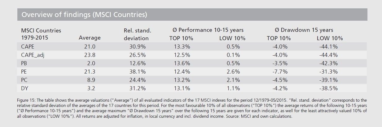
We use a composite of valuation indicators to give a broad view of how the world’s stock markets are priced. And as you can see in the table below, it supports the CAPE conclusion I referenced earlier in this piece…
Lower starting valuations lead to higher returns, and higher starting valuations lead to bigger drawdowns and losses. You can even use dividend yield, which resonates with most people more for some reason, and have similar results.
Source: Star Capital
So don’t make the mistake of thinking that when an overvalued security continues rising in price, it invalidates the valuation indicator.
So where are valuations today?
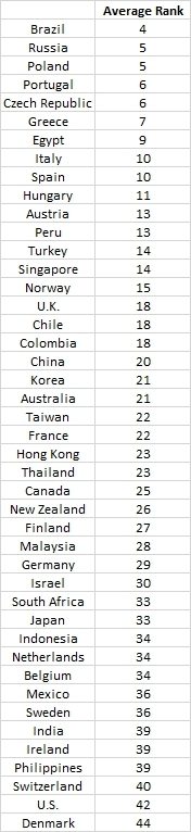
We send out a comprehensive valuation update every quarter to The Idea Farm list. It includes not only the CAPE ratio for 45 countries, but also 10 year variants of Book, Cash Flow, and Dividends. Below is the average rank (not ratio, just the order ie 1 is cheapest 45 is most expensive) of the countries across all of these variables as of year end 2015.
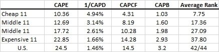
Also, below are the average values for each quartile. We express dividends as a yield. Note that the Price to Book for the cheap bucket is around 1, the average around 1.8, and the US at a whopping 3.2!
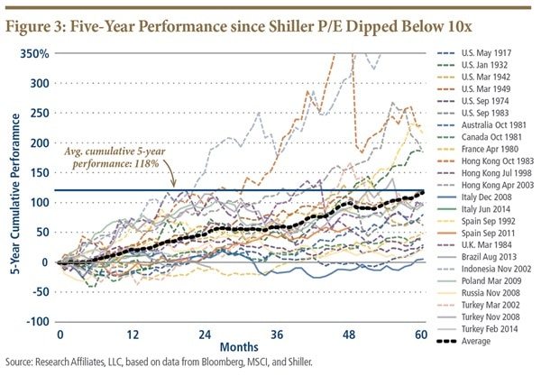
Here is also a late addition chart from PIMCO/Research Affiliates that shows the future 5-year return to markets when they decline below a CAPE ratio of 10…17% per year returns!
If you don’t want to pour through the data, here are some quick takeaways:
- US stocks are expensive, but not terribly so and certainly not in a bubble.
- Foreign stocks on average are fair-to-cheaply priced, with emerging cheaper than developed.
- The cheapest 25% of global stock markets are very cheap.
Fortunately, we don’t live in a world of only one choice. You’re not limited to the $100 per square foot home, the Bentley, or just U.S. markets.
There are countless investment opportunities all over the globe, and the value indicator works perfectly well in finding them. The only question is whether you’re looking.