780%.
That’s the amount of gains you would have missed had you followed the market timing strategy I’m going to describe in the following article that utilizes the CAPE ratio.
Yes, that’s significant. But there’s far more to this story, and I suspect that had you acted on this strategy, you’d have actually been quite happy to miss out on those gains.
Let’s start by rewinding a few decades.
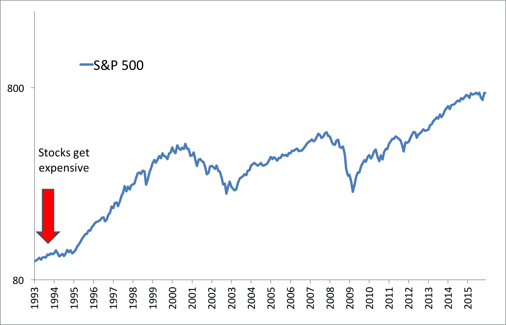
The year was 1993. Over the prior decade, stocks had quintupled in valued – returning about 17% per year. A thoughtful investor may have taken pause after this massive run. Indeed, some did – including, renowned investor, Seth Klarman. Below is a short excerpt from an article Klarman contributed to Forbes in 1992 titled, “Don’t be a Yield Pig“:
“Some investors, desperate for better yield, have been reaching not for a new Wall Street product but for a very old one–common stocks. Finding the yield on cash unacceptably low, people who have invested conservatively for years are beginning to throw money into stocks, despite the obvious high valuation of the market, its historically low dividend yield and the serious economic downturn currently under way. How many times have we heard in recent months that stocks have always outperformed bonds in the long run? Funny, but we never hear that argument at market bottoms. In my view, it is only a matter of time before today’s yield pigs are led to the slaughter house. The shares of good companies and bad companies alike are vulnerable to sharp declines. Moreover, many junk bonds that have rallied will tumble again, and a number of today’s investment-grade issues will be downgraded to junk status if the economy doesn’t begin to recover soon. What if you depend on a higher return on your money and can’t live on the income from 4% interest rates? In that case, I would advise people to ignore conventional wisdom and consume some principal for a while, if necessary, rather than to reach for yield and incur the risk of major capital loss. Stick to short-term U.S. government securities, federally insured bank CDs, or money market funds that hold only U.S. government securities. Better to end the year with 98% of your principal intact than to risk your capital roofing around for incremental yield that is simply not attainable. I would also counsel conservative income-oriented investors to get out of most stocks and bonds now, while the getting is good. Caution has not been a profitable investment tactic for a long time now. I strongly believe it is about to make a comeback.”
Klarman’s words were certainly strongly-cautionary. So what exactly was the state of the market at the time in which he wrote them? Just how expensive was it?
The long-term cyclically adjusted price-to-earnings (CAPE) ratio had just crossed above 20 at the end of 1992. This placed it on the high side of historical valuations of around 16, though not by too much, and investors had seen similar valuations in the 1960s, 1920s, and 1900s. A bullish-oriented investor could have easily brushed aside overvaluation warnings as a CAPE of 20 put the market nowhere near bubble territory, not the max reading of 33 that the CAPE ratio reached at the peak of the Roaring Twenties.
Nevertheless, let’s say a conservative investor heeded Klarman’s warning and the elevated CAPE, and sold all of his U.S. stocks. Now, what this investor couldn’t have known at the time is that the CAPE ratio would remain elevated for most of the ensuing 20+ years (with the brief exception of cheapness in 2008 and 2009). So what sort of missed market gains would that have translated into for this individual?
As referenced at the top of this paper, 780%.
That’s a lot. Indeed, from 1993 through October of 2016, stocks have averaged about 9% per year.
“The Market Enjoys a Huge Run Even After Reaching ‘Expensive’ Territory”
This would lead many investors to conclude that using a valuation metric like CAPE was a poor choice. A broken, useless indicator. Or as Professor Damodaran concluded: ‘This is one of the most oversold, overhyped metrics I’ve ever seen,’
With all due respect, they would all be wrong.
The Flawed Logic Behind “CAPE Doesn’t Work”
Imagine yourself in Vegas.
Let’s say you’re at the blackjack table. The tourist seated at the end of the table is showing a great hand of King and 9 for a total of 19. The dealer’s face-up card is a 6. The tourist, who has had a few too many drinks at the table, motions for the dealer to deal another card.
You, being of sound mind and statistical knowledge know that this is a near-guaranteed suicide move. The drunk tourist is transforming a hand with high odds of winning into a near guaranteed bust. Before the dealer can turn over another card you blurt out, “Are you sure about that?!”
The tourist ignores you and receives the extra card. It turns out the gambling gods are on his side, and he draws a 2.
21! The dealer draws to a 19, and the tourist wins his bet.
He turns to your direction, sneers, and says “I told you it was the right move!”. He collects his winnings and moves onto the slots where he will not be bothered by the likes of you.
The tourist won the hand, but does that mean he made a good bet?
Of course not. He transformed his odds of winning the hand from roughly 70% to an almost certainty of losing by taking another card.
This dynamic is no different in the investment markets. If markets are overvalued, is the safer bet that the markets will continue rising or offer sub-par returns? Statistically, the likely outcome is sub-par returns. Of course, that doesn’t mean the markets won’t continue climbing despite lofty valuations. And, of course, a bullish investor could make such a bet as did the tourist – and win. (And as we’ve demonstrated in the past, a cheap uptrending market is the best…but second best? An expensive uptrending market…) But that doesn’t mean it’s a good wager.
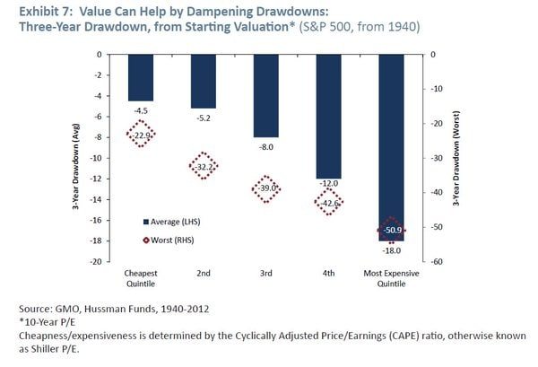
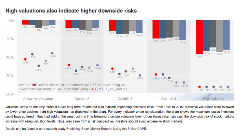
Most investment research has shown that when people buy an expensive market, they have a higher chance of big drawdowns in their future. Here are two charts from GMO and Star Capital that demonstrate this:
Critics may reply, “Ok, but I’m rational, and I can sit through drawdowns, what then? The data has shown that we would have missed out on 780% in gains. Ipso facto, CAPE doesn’t work!”
Well, not quite.
First, even though you claim you can sit through drawdowns, nearly all research on investor psychology suggests many cannot. But that’s a different discussion. For the moment, let’s just assume you decided to get out of stocks. If so, what would you have done with your money? After all, getting out of stocks would have meant getting into some other asset. And unless you were like my grandfather who literally kept his money under his mattress, you have to do something with that cash.
You could have parked your money in U.S. government bonds. How would they have performed?
S&P Returns Aren’t That Much Greater Than 30-Year Bond Returns, 1993 – 2015
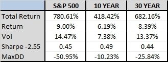
While 10-year bonds didn’t keep pace with stocks, longer-term bonds had similar returns with near identical volatility. More importantly, however, 30-year bonds had roughly half the drawdowns suffered by stocks – so, a much smoother ride. This would have increased the odds you stayed invested and actually saw this return.
All three of these choices had a similar Sharpe ratio, which means analogous risk adjusted returns. We would expect this over long periods as most asset classes cluster around Sharpe ratios of 0.2 to 0.3 over time.
Can CAPE Tell Us When to Switch Asset Classes?
Now, what if we needed the CAPE ratio to be a bit more agile for us? Rather than just telling us to move out of stocks (and into bonds) and be done with it, what if we needed CAPE to tell us when to be in stocks, versus when to switch to bonds, and possibly switch back? How would that perform?
I’ll make an arbitrary “switching system” rule – we’re in stocks when the CAPE is less than 20, bonds when it’s over 20. In the chart below, we evaluate this switching system with both 10-year bonds and 30-year bonds. Where do the numbers shake out?
CAPE Switch Strategies, 1993 – 2015
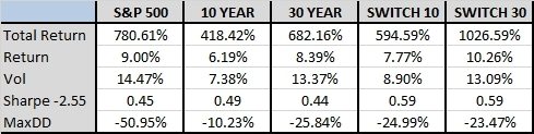
This basic switching system would have done a good job alerting you when to make the leap from stocks to bonds. In both cases, risk adjusted returns climbed. But notice what happens when we use 30 year bonds – ALL the metrics improved, returns, volatility, Sharpe, and drawdowns. I’d call that a win, wouldn’t you?
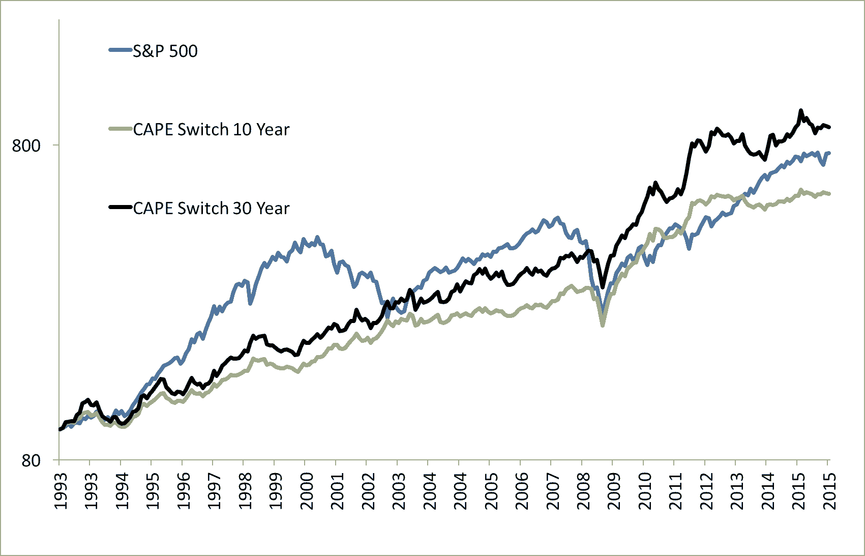
Using the CAPE Switch 30 Strategy Outperforms Just the S&P, 1993 – 2015
So even at this point, it appears we have strong evidence that using CAPE is, in fact, an effective timing metric. But if you’re not convinced, perhaps we can sway you with another tweak.
The World is Your Oyster
A moment ago, we made the point that selling stocks means starting a new position in some other asset. Our earlier example invested in U.S. bonds as that other asset. But we don’t live in a world consisting of only U.S. stocks and bonds. Savvy investors will always seek out assets that are positioned to offer the best return on investment, regardless of the country. So why not replace U.S. bonds with the cheapest stock markets in the world?
In this scenario, let’s compare our switching systems to a new strategy in which we invest in the cheapest 25% of global stock markets as identified by the CAPE ratio.
Investing in Global Stocks with Low CAPEs Dominates the Switch System, 1993 – 2015
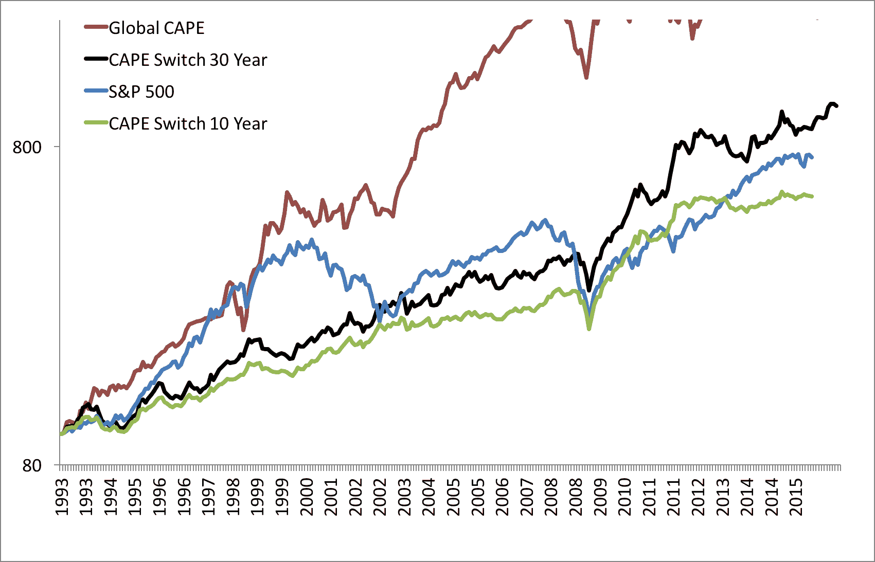
We literally had to resize the axis.

This strategy beat the S&P 500 by four percentage points per year. Despite higher volatility (mostly the good “upside” volatility, by the way), it still resulted in a higher Sharpe ratio and lower drawdowns than sitting in expensive US stocks.
Summary of Strategies and Assets, 1993 – 2015
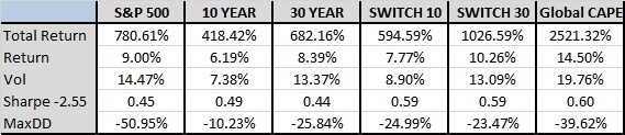
So let’s return to our conservative investor wondering what to do with his money at the end of 1992.
By forgoing an expensive market (by CAPE standards), he missed 780% in U.S. stock gains. But had he used CAPE applied to a global investment set, he would have realized 2,500% in global stock gains instead.
Does CAPE appear broken to you?
Where Do We Differ?
Perhaps the source of this whole “CAPE works – no, CAPE doesn’t work” argument reduces to a simple misunderstanding. It seems detractors are asking CAPE to clearly tell us “in or out” applied to just one asset class or market. But is that fair? Or even rational? No.
We would argue that investing is all about finding value anywhere, and not just a binary decision of is this market expensive, or not? But rather, where can I find the best returns, anywhere?
No single metric is able to tell you with 100% accuracy when to buy in and when to sell out. That’s demanding perfect future knowledge…which is irrational. And we have often said, valuation is a blunt tool that may help tilt the probabilities in your favor, but it does not guarantee a certain, desired outcome.
Below is a fun chart of yearly CAPE values. Starting in 1900, the chart shows initial CAPE values and their respective future 10-year returns from those values. Dark green are the cheapest starting years, and red is the most expensive.
As you’d expect, most of the red and yellow starting years (expensive markets) end up on the left side of the chart, meaning low 10-year returns. But notice – some expensive starting-markets still end up on the right side – meaning double-digit 10-year returns. Sometimes the drunk tourist makes his hand. But most of the time he will head back to his room with empty pockets.
It works the other way as well. Notice the handful of inexpensive, green starting years that actually wind up posting anemic 10-year returns.
A Spectrum of Possibilities
Any investor who has been in the markets for long enough won’t be surprised by this. Markets don’t always behave as we expect, or want. But as the chart above illustrates, while you can’t be certain of an outcome, you absolutely put the odds in your favor by investing in cheaper CAPE markets, while avoiding expensive CAPE markets.
Let’s circle back to detractors who claim CAPE doesn’t work on a single asset class. We would respectfully suggest that trying to use CAPE in that manner is misguided. The real value of CAPE is when it’s applied to an entire global investment set, telling you which assets/markets are likely to treat your money the best (think “optimizing a broader portfolio”). CAPE’s value is not in predicting what a single asset class or market is going to do all by itself in a vacuum. But as we’ve intended to illustrate in this paper, when you use CAPE in the broader, logical way, the data seems to prove it’s a wonderful timing tool.
Let’s wrap this up with a fun, slightly-different way of tackling all this. Two questions.
First question: Would you rather invest in the cheapest 11 stock markets in the world – with an average CAPE ratio of 10, or the most expensive – with a value of 24?
Seems obvious, but given the contempt which many investors feel toward CAPE, let’s rephrase:
Would you rather invest in the cheapest 11 stock markets in the world, offering an average dividend yield of 5.6%, or the most expensive, with a yield of 1.6%?
If you believe CAPE is fundamentally flawed and useless, then you’d find this distinction moot.
But maybe putting CAPE’s real value into perspective is better accomplished with our second question…
If you’re in Vegas, sitting on 19 at the blackjack table, do you think you’ll win more often by asking for another card, or staying with your existing hand?
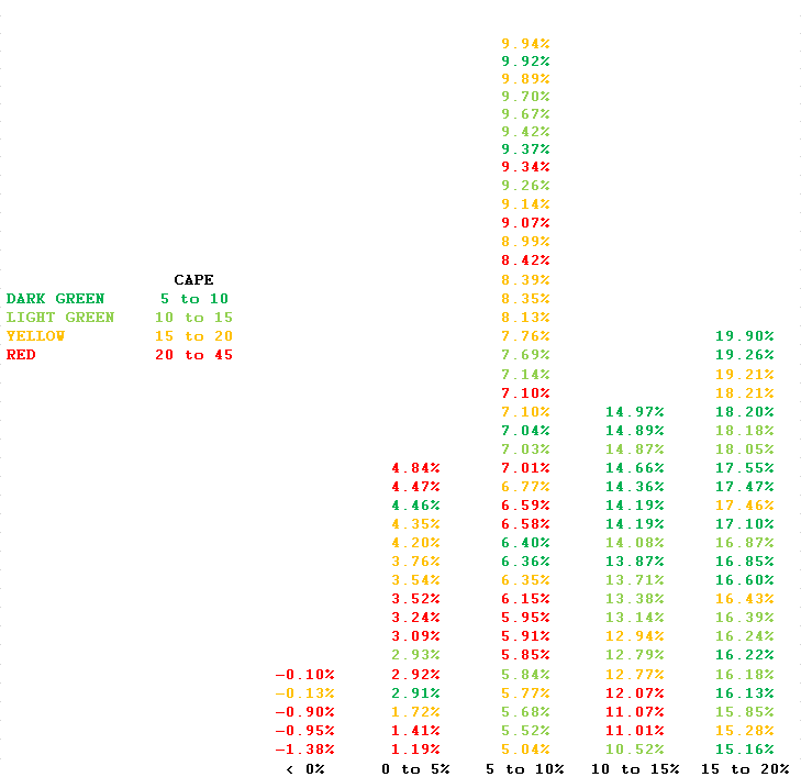
Appendix
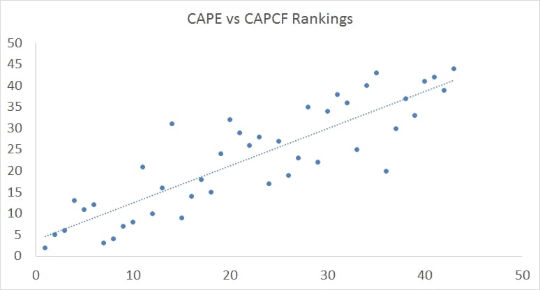
We calculate CAPD, CAPB, CAPE, and CAPCF and use a valuation composite across all variables which we send out to our Idea Farm subscribers each quarter. Here is an example that illustrates that the cheap countries based on earnings are pretty similar to the valuation rankings for cash flow.
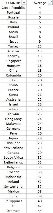
Here is our valuation ranking from the end of last quarter 9/30/2016 (NOTE THESE ARE NOT CAPE RATIOS, BUT THEIR AVERAGE RANKING ACROSS CAPD, CAPB, CAPE, and CAPCF):
Want more information? Here is a CAPE ratio linkfest from two years ago…
Is the CAPE ratio good at predicting future returns? (Yes) Is it perfect? (N0)
Does the CAPE ratio work on individual stocks? (Yes)
Does the CAPE ratio work for sector rotation? (Yes)
Does valuation and sentiment correlate? (Yes)
Using CAPE to get out of stocks in the 1990s, is that a bad thing? (No)
Do accounting changes matter (Not really)
Does it matter what CAPE ratio you use? ie 1,3,5,7, 10 year? (Not really)
Can you combine trend and valuation to time the stock market? (Yes)
Does buying expensive markets result in bigger losses? (Yes)
Do the best and worst times in history to invest correlate with value? (Yes)
Another post on trend and value
Behavioral reasons value works
and Global Valuations
Does CAPD say the same thing as CAPE? (Yes)
Are market cap weighted bubbles one reason the CAPE ratio works? (Yes)
Did the CAPE ratio work in 2013? (Yes)
How long does it take to work off a CAPE ratio bubble? (About 2-4 years)
Does it matter what value metric you use? (Not really) also here
How big was the US bubble? (Normal for bubbles, tiny vs. Japan)
Are most stock markets cheap? (Yes)
Does adjusting CAPE ratio for inflation make sense? (Perhaps)